

2025 Spotify Wrapped: the best year yet?
A UX review of Spotify’s biggest recap yet

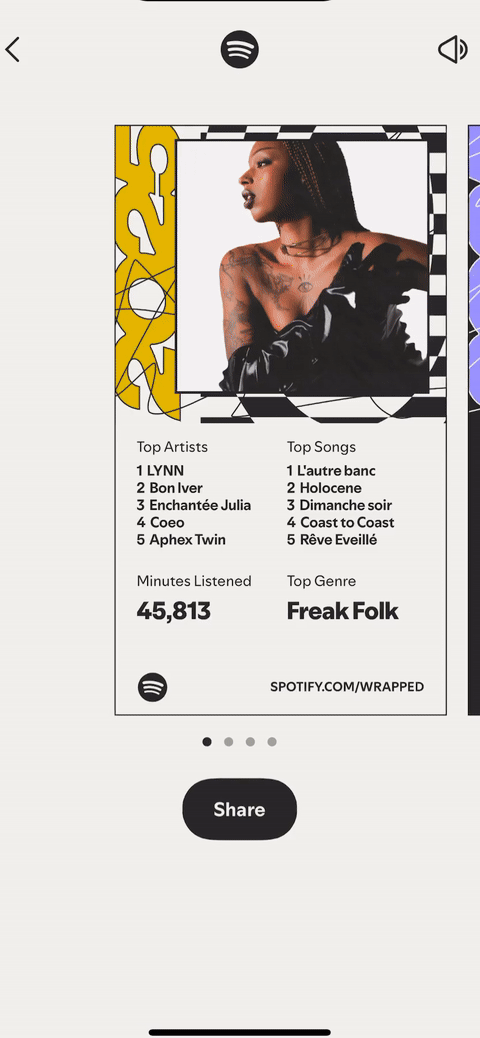
How old are you in music?
Turns out I’m 24.
That’s the angle for the 11th year of Spotify Wrapped: your age in music.
But it’s not just that.
There’s parties, sprints and quizzes this year.
According to the team “the experience is more captivating, layered, and revealing than ever before.” It has a total of 6 fan favorite features and 10 new ones, bringing the total moments to 16.
What matters isn’t how many moments there are, it’s whether they feel simple, meaningful, and share-worthy.
The timing matters, too. Since September this year, artists are leaving the ‘garbage hole’ platform, including major label Massive Attack, given CEO Daniel Ek’s investment in AI military tech.
And after 2024’s lukewarm reception, Spotify couldn’t afford another year that felt flat.
Last year I wrote a piece on Spotify Wrapped 2024, and safe to say it felt like a flop -described “a homework project that was turned in late”. It was stark difference to the creative, fun years before. In 2021 to 2023 we had: Genre Burgers, Myers-Briggs-come-tarot-card Listening Personality and Audio Auras:
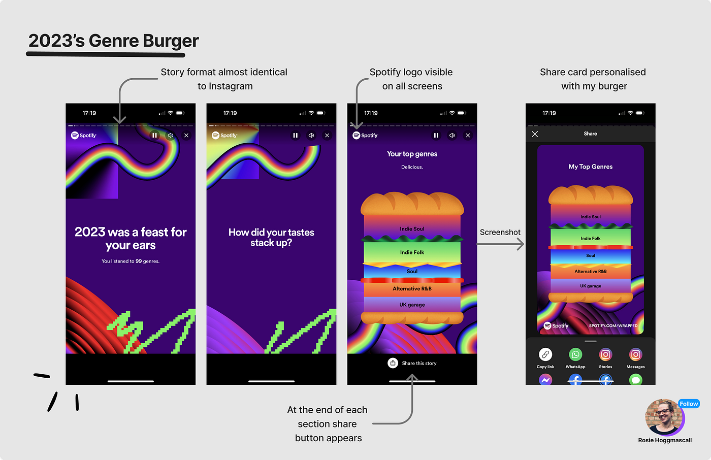
2023: Genre Burger
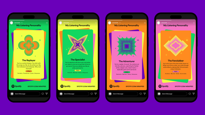
2022: Listening Personality
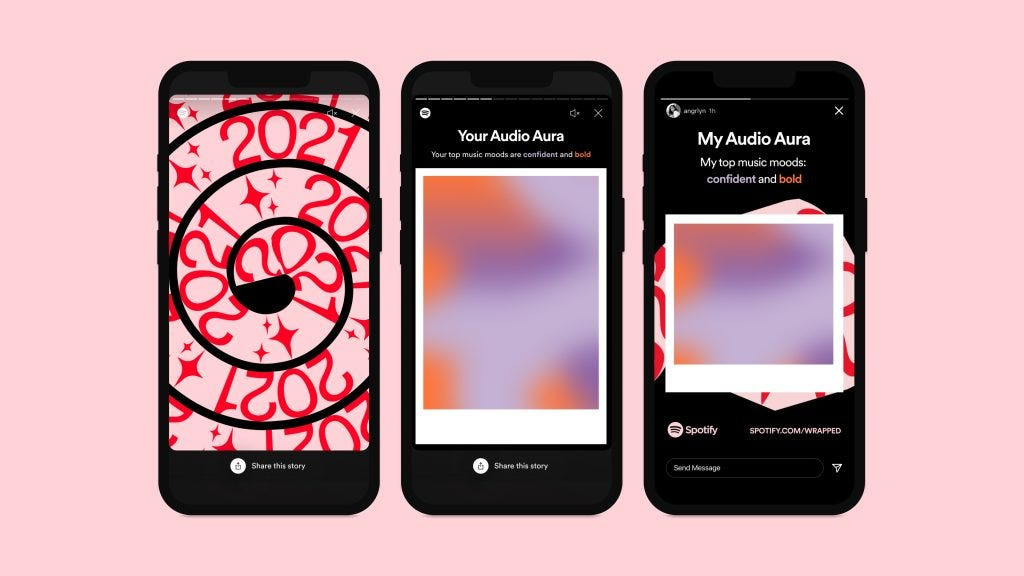
2021: Audio aura
Whilst last year felt flat and surface-level in the execution, it did impact metrics in a positive way.
The first 12 hours of Wrapped 2024 were the ‘biggest they’ve seen’, up 26% compared to the same time period in 2023. On socials, they’re seeing a ‘record number of shares’. A few years before, in 2021 the campaign drove 60 million shares and saw 120 million users engaging with the feature in 2022 (28% of their total MAU at the time).
It’s too early for 2025 stats, so instead I’m judging 2025 Wrapped on the experience: how it opens, how it rewards you, and how it nudges you to share. We’ll run through:
The opening: the UX to wrapped and first look
Design: why 2025 feels deeper than 2024
Motion: the experience that keeps you scrolling
Interaction: the mini-games turning a recap into a product
To kick off: first impressions.
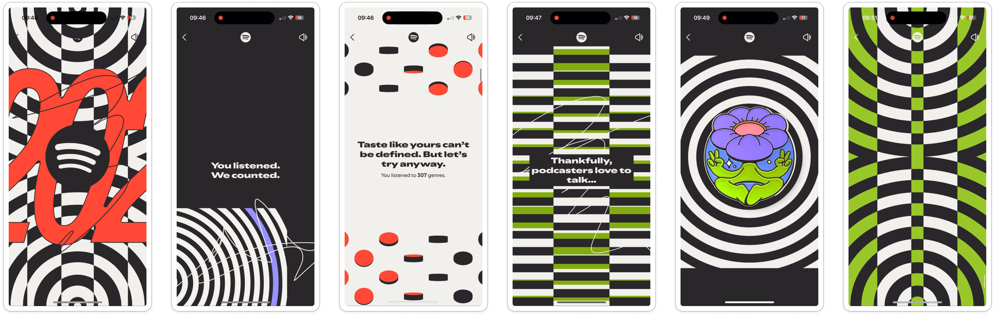
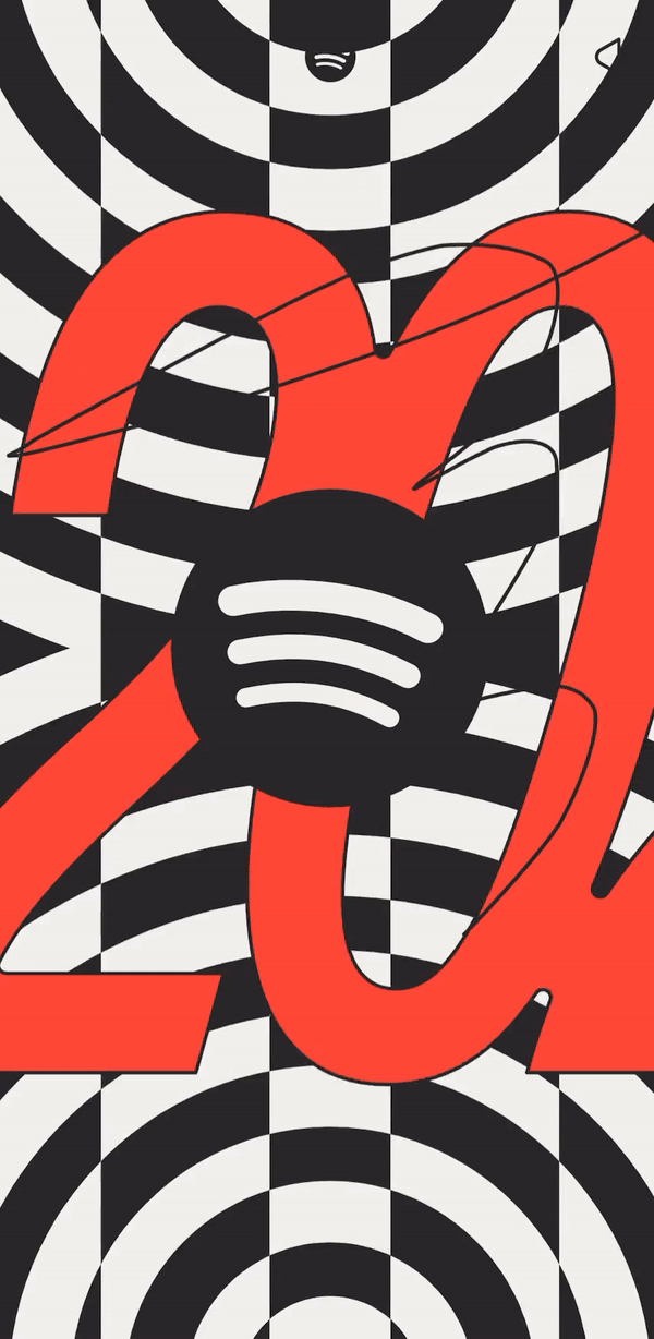
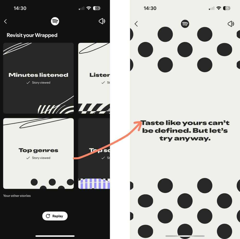
First impressions: Wrapped goes vertical
For the past few years, Wrapped has been story-style. Tap, tap, tap through the sections.
This year it’s a continuous vertical scroll, which feels more TikTok feed than Instagram story.
Minor detail, you might think. But it makes all the difference.
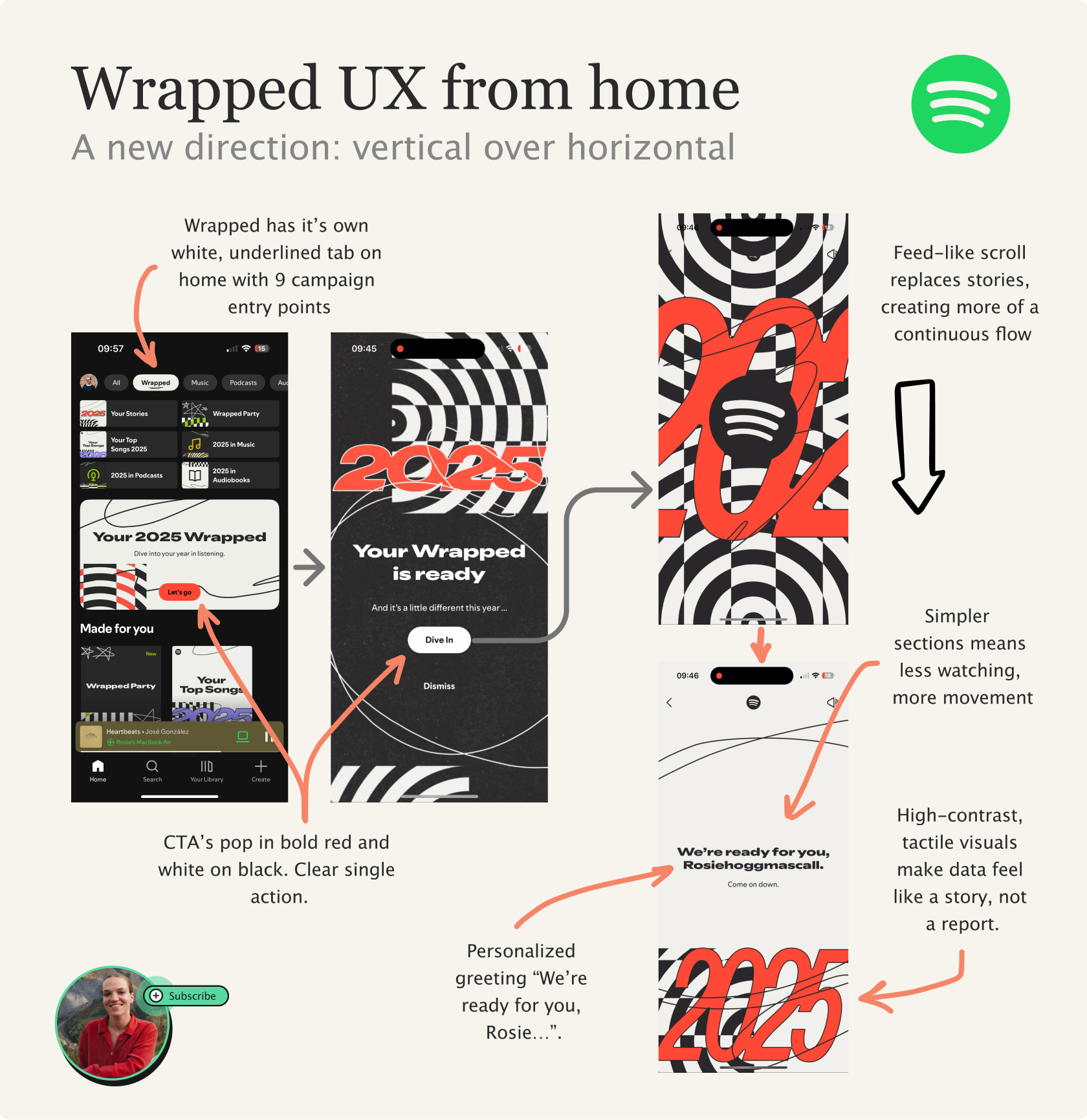
It feels more like a never-ending arcade: bright & colourful, with so many fun games. Less orderly, more chaotic, and easier to get lost in (in a good way).
Each scroll drops you deeper into the race-car-meets-circus aesthetic.
Once you notice the scroll, the next thing that hits is the design direction.
Second impressions: Texture you can almost feel
The design is so layered you can almost feel it through the screen. There’s something about the colours, patterns and shapes that gives it depth.
Compared to 2024, there’s such a stark difference - one that I can’t quite put my finger on.
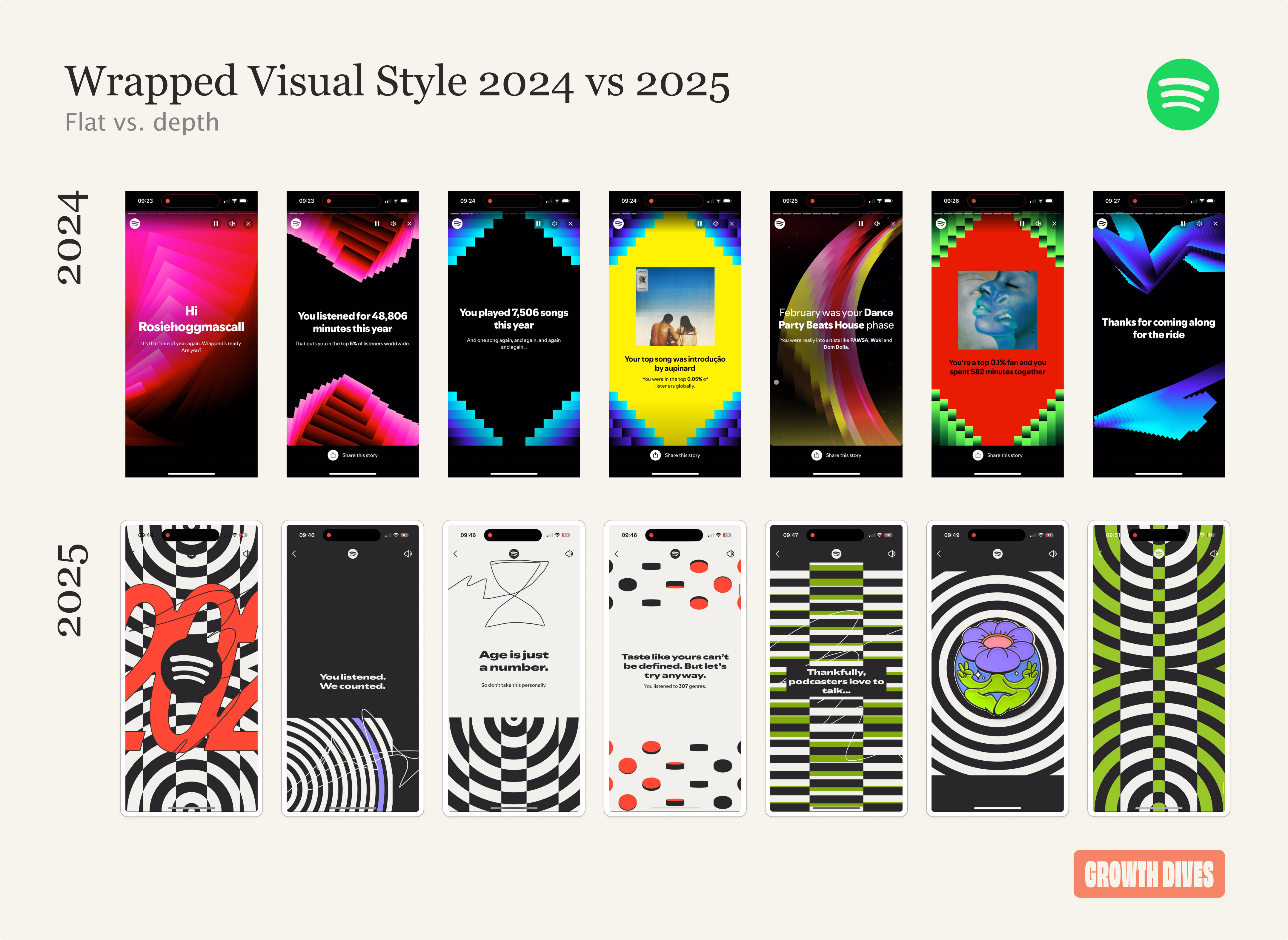
Visual design isn’t my area so I did a bit of research here into what is actually creating that depth. A few things stood out.
2024:
Lots of neon gradients and glowy shapes, but not much variation beyond that
Most screens follow the same structure: text centered & decoration around it
Feels clean, but a bit flat and same-y
2025:
More patterns (stripes, spirals, dots, optical tricks)
A mix of line styles: wavy scribbles alongside sharp, straight geometry
A blend of shapes & sizes: tiny dots next to huge circles and full-page patterns
Both soft and bold colours. High-contrast black and white with bold accent colours (red, green, purple).
Mix of art styles: geometric, hand-drawn illustrations, sticker-like icons that create a layered feel
More negative space and more variation in composition, less ‘same card again’
As a result, 2024 feels like a set of nightclub templates whereas 2025 feels like a whole world you’re moving through.
And, when you layer in the animations, this world is taken to the next level.
Third: Motion design with personality
The animations do three jobs: pull you forward, add depth and turn separate screens into one continuous flow.
Notice in this first screen that the pacing goes from intense moving, full-screen patterns to calmer, spacious screens. This is called ‘breathing’, and is the same technique as using whitespace: to bring attention to the things that come next and avoid overwhelm.
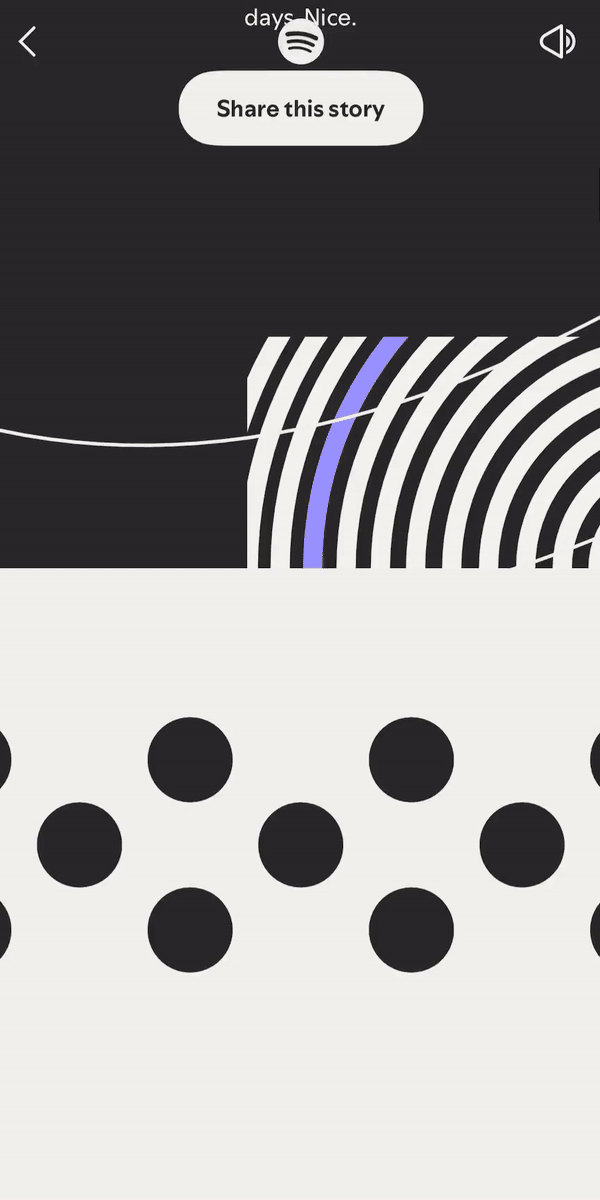
There’s also parallax working here. Different layers move at different speeds, which makes the visuals feel almost 3D.
The best animation design is the artist sprints.
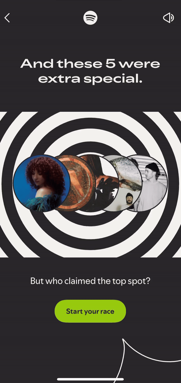
They’re kinda ridiculous in concept, but also a really creative way to show change through time. My iphone vibrates when the artists start too, like the bang of a gun at the start line.
The same goes for the files section, towards the end of my Wrapped. I can flick horizontally through files that give me a snapshot of times in the year.
The little file waving and pointing arrows inviting me to tap on my report. For me to then see a tidal wave of folders. In each there’s a little nugget:
Biggest music listening day
Most diverse day
Most nostalgic day
It feels like a music photo album. My “most nostalgic day” was exactly that, a friend had just re-introduced me to Fela Kuti, and Wrapped reminded me of that moment.
It also allows me to scroll horizontally, breaking the vertical scroll pattern, and making it feel like a hidden treat.
Yummy.
Fourth: interaction design
Unlike last year, you can interact with your Wrapped. And I mean more than just a tap or a scroll.
I actually missed this the first time, but when I went back to my top song, it turns out it is a live quiz. I selected one and was met with a red cross told: failure builds character.
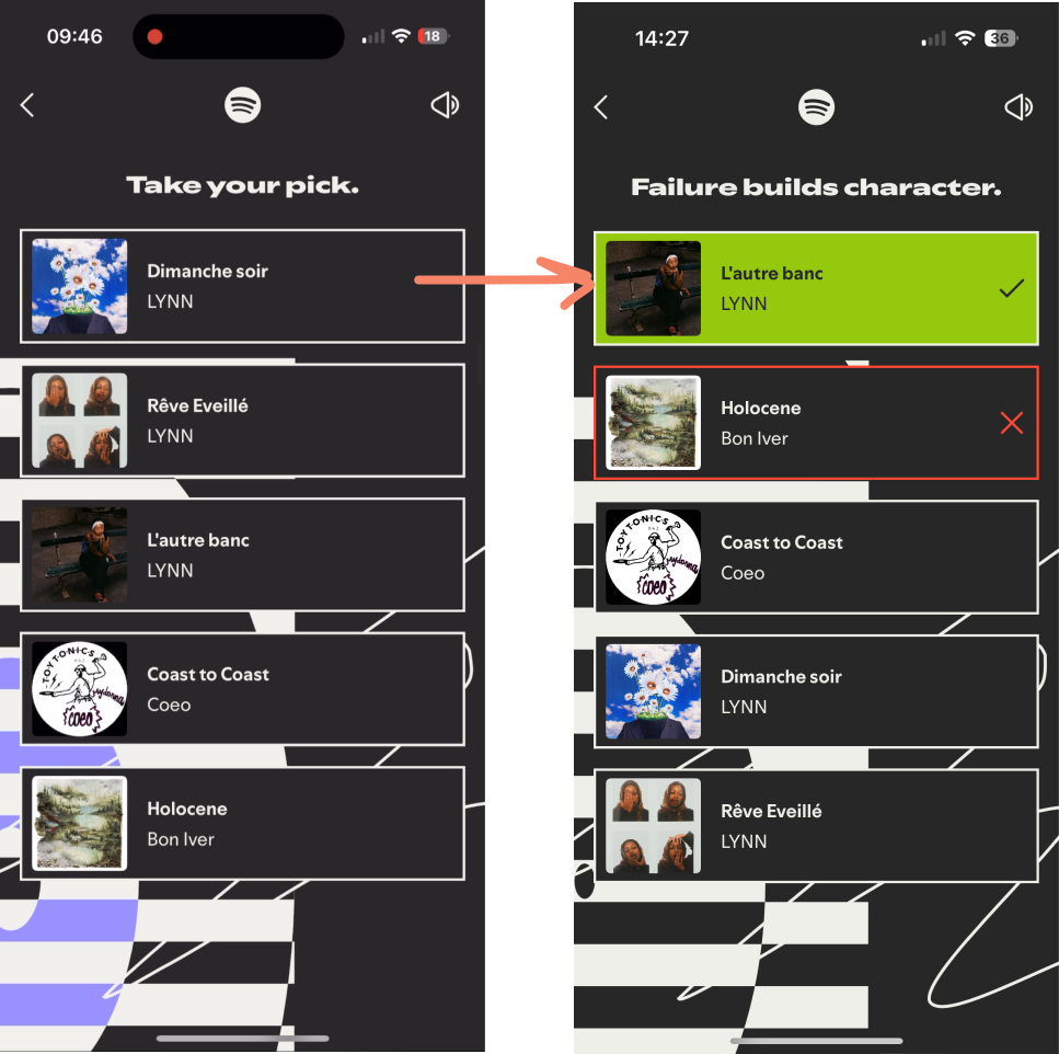
Very funny.
There’s also wrapped parties where you can compare your Wraps live with others. In this way, Wrapped feels more competitive. It also moves wrapped from being single player to multi-player, adding a bit of gamification with a leaderboard.
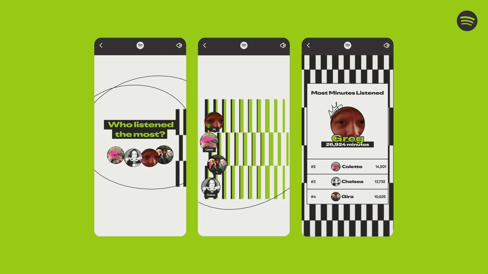
There’s a tiny network effect here: the more friends participate, the better the feature gets. This is such an interesting one I think it needs a whole launch of its own, else it flies under the radar.
Finally, Spotify has made it easier to re-enter Wrapped. From the Wrapped tab, I can jump straight to specific sections instead of scrolling all the way through again. It turns Wrapped into something you revisit, not just something you look at once then leave.
What’s the impact of these small interactions? Wrapped stops being something you watch and becomes something you do.
The quiz adds play, the party adds people, and the navigation adds replay.
The culmination of all these this is that the wrapped feels stickier, more shareable, and more likely to pull you back in after it ends.
To conclude, is this the best wrapped?
It’s very hard to compare Wrapped year-to-year. Expectations get higher, the path is well-trodden and there’s a pressure to bring in fresh concepts each time.
Last year Spotify laid off a lot of the team, and as a result last year was a particular low. That context makes it easier for this one to stand out.
However, if we’re talking about the most detailed, most engaging, highest complexity, more interactive Wrapped, then in my view 2025 wins.
On concept, I’m less convinced.
“Music age” is an incredible hook, but it doesn’t stand out as much against the sheer mass of other features. The team went big this year, and I wonder if the core theme could have been pulled through better.
In any case if you’re building your own annual recap, here’s three lessons to take away:
Make it a world, not a slideshow
Depth isn’t more stats, it’s better pacing, better interaction, and a clearer story
Design is what turns data into a moment people want to share.
Side note: I personally loved writing this deep dive. I’ve not gone so detailed on interaction design or visual styles before - if you’re someone with expertise in that space, would love to know any extra insights you see ✨
This is a great breakdown! I think I would say this is one of the best Spotify wrapped across the years because they have learnt from their mistakes and also they added a lot of interactions rather than just one-way communication which made it much more unique.