

After 6 months, I'm selling my Oura ring.
Data without the why does more harm than good.

Half a year ago, I bought an Oura ring.
Turns out, so did a load of other people.
More than 5.5 million Oura Rings have been sold since launch, with sales projected to hit $2 billion this year (2X 2025). Ōura is now valued at $11B - making it the most valuable standalone wearable company in the world
Safe to say, I was excited.
The promise is compelling: a device that fits into your life while helping you understand yourself better: brain fog, digestion, food, cramps, temperature, whether your bedroom is too light for sleep. The underlying patterns I don’t notice until 10 years too late.
I was especially excited for women’s health tracking without turning everything pink and floral.
With 50+ health metrics and 30+ PhDs working for them I believed the promise of ‘revolutionary insights into your wellbeing’.
Instead, after 6 months I’m selling it.
Not because the data was inaccurate.
Because it never really became insightful.
Here’s what happened.
Early on, I was willing to do the work
Onboarding was 38-screens long…

But I actually didn’t mind.
I’ve bought a £300-odd accessory, I expect to have to set it up.
There’s a lot of positive friction expected within health and fitness apps - adding height, weight, age; connecting health apps, syncing data. Without this, as users we know the product doesn’t have a full picture.
Across Oura’s onboarding I have to:
Download the app Create account
Put the ring on its stand
Get an email to pay for a subscription (not in the app, on a webpage)
Navigate back to the app
Add in my personal information
Connect apple health
Answer some personalization questions
Finally, put the ring on
Get into dashboard and explore
It went as smooth as it could, aside from their health defaults putting me as a 5ft 7in man.
Which, I accidentally accepted then couldn’t go back.
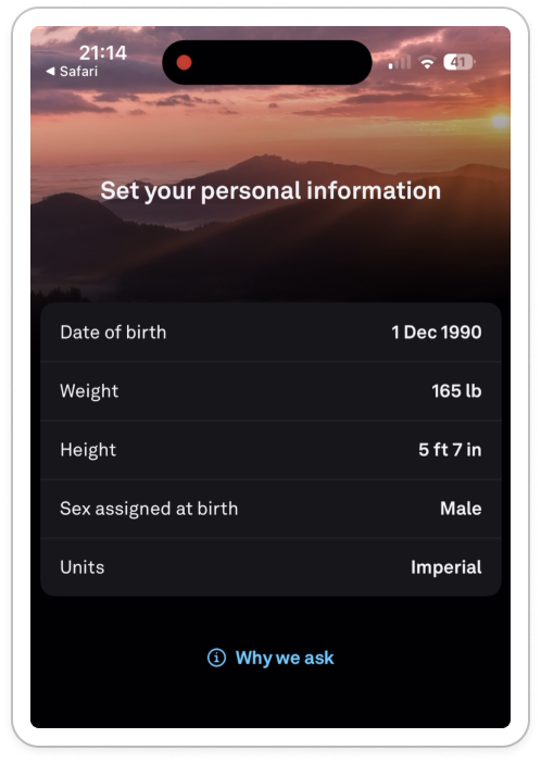
Worried I was going to be a man forever, this stressed me out for most of onboarding, until I managed to change in settings later.
Once I was into the product (after a cool ‘wave to test the sensor’ test), I saw empty charts.
I tapped around a bit looking for some onboarding, but appreciated that I just needed to sit and wait at this point.
After my first night’s sleep, the data started to trickle in.
At first, new data felt cool.
Never in my life have I seen so much of my own data at once:
Bed time
Awake time
Time to fall asleep (latency)
Sleep consistency
Body temperature
Heart Rate Variability (HRV)
Resting heart rate
Sleep stages (REM, deep, light)
Respiratory rate
I could go on (there’s 50 after all).
This was the first magic moment for me. I love learning, and I had a lot to do. What’s HRV? What should mine be? Is that good?
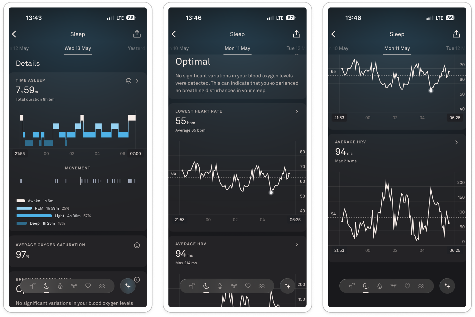
For the first month, I was adjusting to the terminology, the charts, getting to know what ‘good’ looked like for myself.
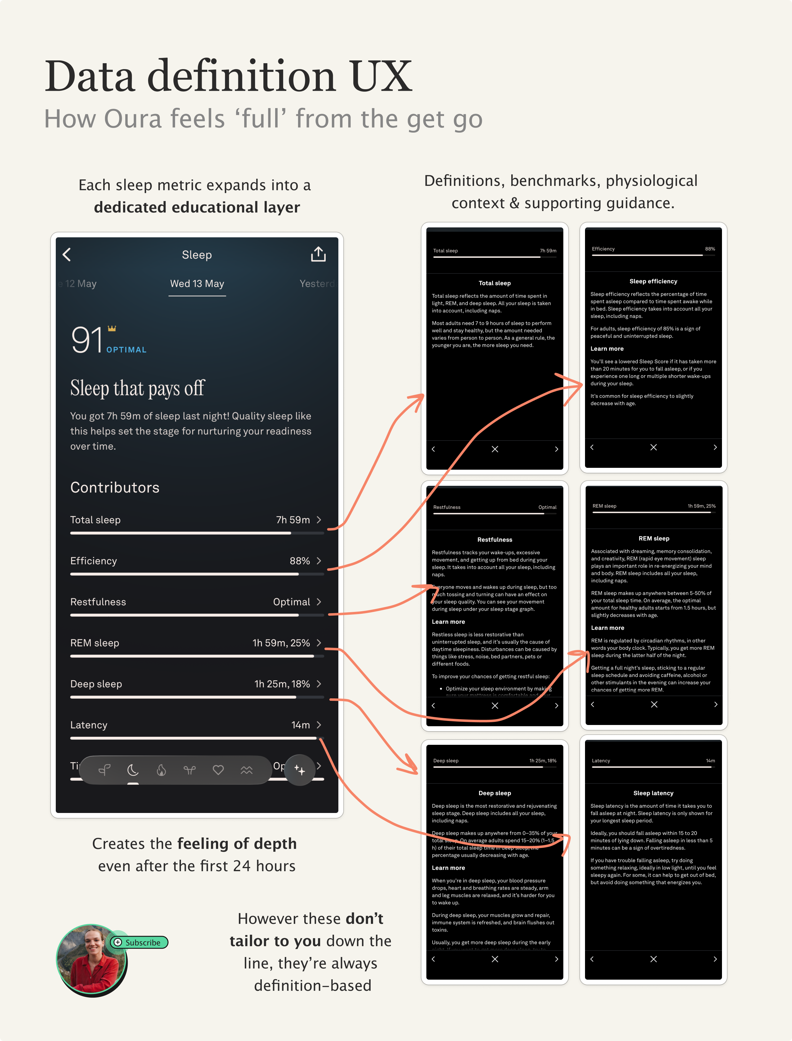
I felt supercharged by data. Take the sleep data: 7 individual factors all with their own definitions page.
It makes for an early experience that feels deep, rich and interesting.
Time-to-interesting-datapoint was fast.
It gives me the ‘what’ is happening. But over time, I realized I was still doing most of the interpretation myself.
The problem was that the product kept explaining sleep in general, rather than my sleep specifically.
And that’s because it didn’t have any of my context.
The friction of adding context
At the start, I was keen.
I manually logged ‘tags’ into the app, things that matter to me like:
Hot bedroom
Alcohol
Gluten
Stressed at work
Because this contextual data about my day is what turns the data into insight.
At first, I had to find out how to add tags myself - it felt slightly buried.
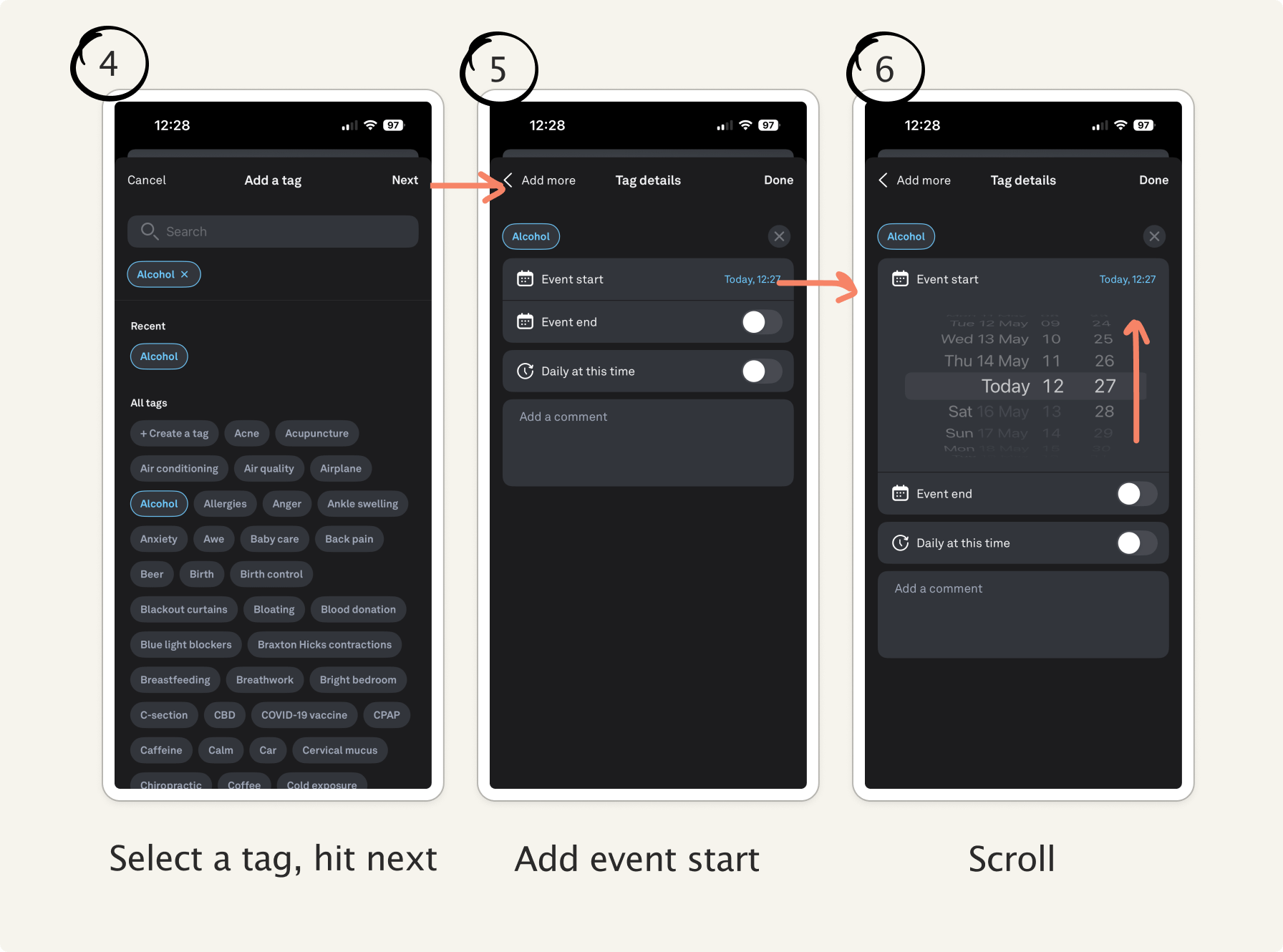
Adding a single tag took multiple steps: select (+), ‘add tag’, search for tag, select, select start time, scroll to the right time, confirm.
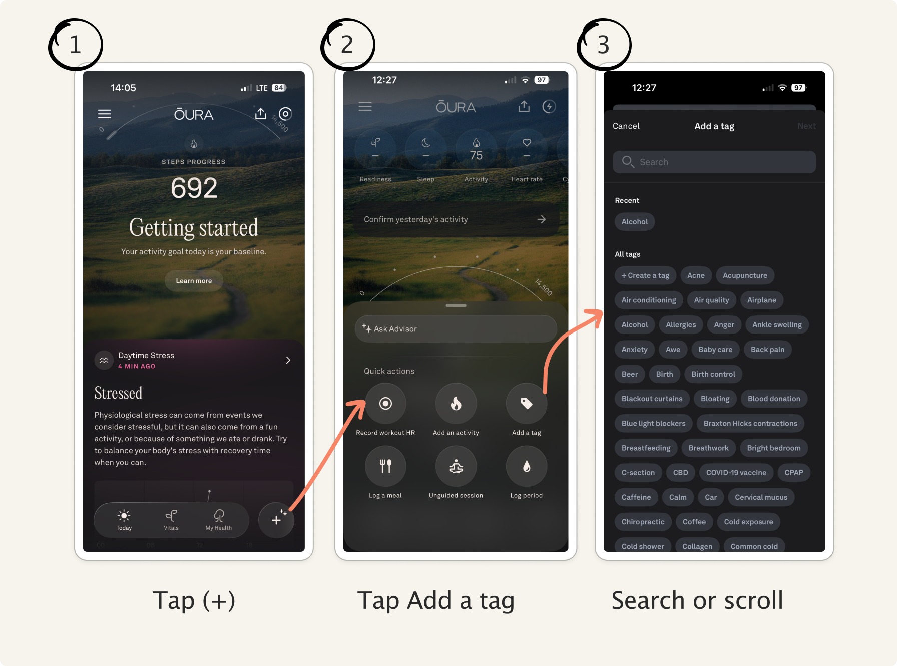
That’s manageable once.
But on some days I was adding 5+, things like: hot room, bright bedroom, alcohol, travel, jet lag, coffee, stress, sauna.
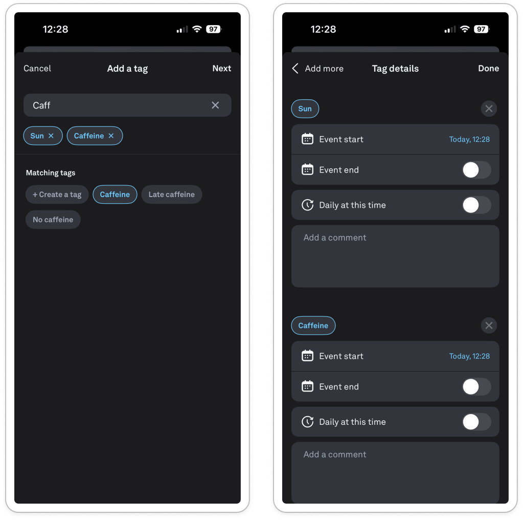
Some of which were moments in time (e.g. sauna) others were full-day (jet lag). Yet the system treated them as the same type of input.
After the first week, it was so time consuming because of how many clicks it takes to add a tag.
So I looked for shortcuts.
I went into the AI chat, recorded a super long diary entry by voice about my day, and asked it to add the tags for me.
Tried again just with typing and it couldn’t.
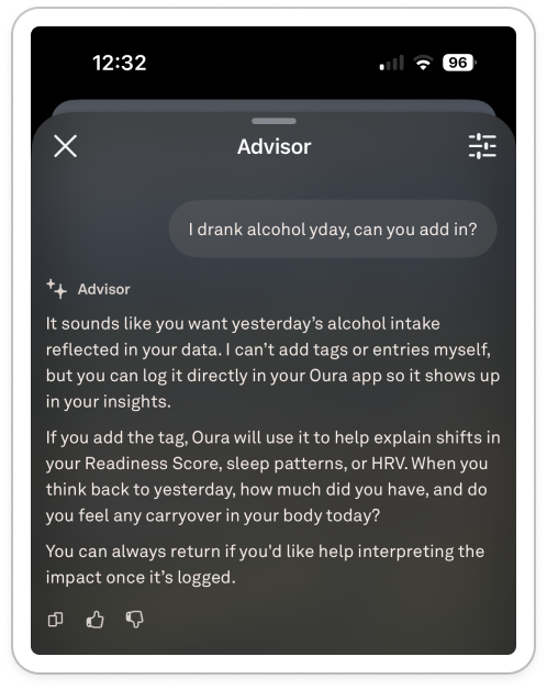
Ironically, the feature best positioned to reduce manual logging wasn’t able to interact with the tagging system at all. The chat wasn’t agentic - it is unable to take actions for me.
I searched for alternative options within the app - scoured the settings. My partner’s Whoop, for example, prompts him with a quick daily check-in each morning which he built himself with common tags. I looked for notification settings to help prompt me.
Nope, nothing. I’m left with a six-tap flow for each tag.
So, after a week of manual tagging, I give up.
And without consistent behavioral context, the product mostly returned to explaining metrics rather than interpreting them.
By the time Oura surfaced tags in my face it was too late, I hadn’t built the habit.
My habit loop broke at the ‘reward’ part: I did the action (tag) without the reward (the insights). Over time, there were few triggers to get me to act, and the act itself was too high-friction. The habit loop broke.
The product promises intelligence, but that depends on increasingly active participation from the user. The more of a power user I am, the more overhead I have to do to tag.
Tags are what links your data to your life, and without them I hit a roadblock.
When the insights plateaued
Despite the poor tagging experience, I kept going. I got a dopamine hit from checking my sleep score each morning (I normally sleep well, so it felt good to see the 90+ scores).
I assumed that the data in my sleep and readiness scores - even without tags - would get more interesting over time.
But after a while, I noticed something strange: the app didn’t feel like it knew me at all.
One morning, Oura told me:
“Something affected your sleep last night.”
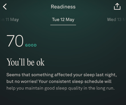
I saw my HRV was red at ‘pay attention’. So I tapped it expecting some explanation tied to my data (% change versus previous, how much lower, any link to other data. How often this has happened to me).
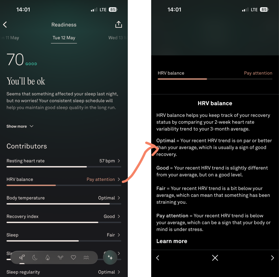
Instead, I am brought to the same definitions page as I see every time:
HRV balance helps you keep track of your recovery status by comparing your 2-week heart rate variability trend to your 3-month average
Yes, I know that by now. It then goes on to define optimal, good, fair and ‘pay attention’.
Oura’s UX feels highly personalised at setup, but surprisingly static over time. Five months in, the app was still interacting with me like a first-week user.
What makes the copy frustrating isn’t just that it’s vague, it’s that the statement feels disproportionately unsophisticated relative to:
The amount of data collected
The amount of effort invested
The scientific positioning of the product
The confidence of the branding
The product detects the ‘what’ but no attempt at the ‘why’:
How abnormal the reading is for me?
How frequently this happens?
Whether it correlates with any recurring datapoints?
How confident the system is in its own interpretation
Instead, the copy in the app goes with “You’ll be OK”.

This is emotionally soothing language is pretending to be insight.
After months of biometric tracking, the output is basically:
Don’t worry about it.
Wow, thanks.
The same pattern appears throughout the app, take these morning home screens:
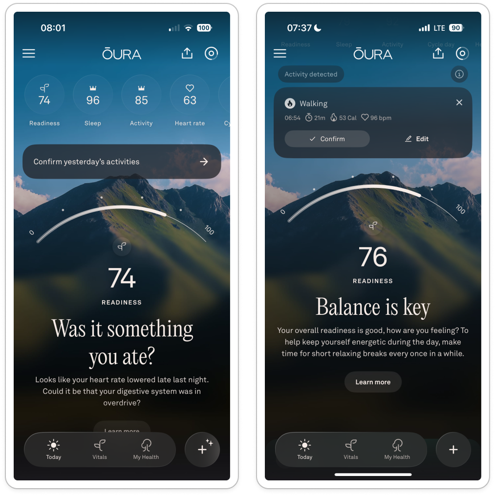
Was it something you ate?
It implies causality without evidence, which feels like bad practice. That feels odd in a product that otherwise positions itself as scientific. The app builds a lot of authority through data and biometrics, then suddenly switches into vague wellness language.
Balance is key
What’s out of balance? Compared to what? Because of which behaviour?
My original optimism and faith in ‘this will learn me’ is constantly undermined by woo woo language and simple definitions.
Over time, the whole experience starts to feel shallow. The app creates this expectation that understanding will get better alongside the data collection, but the interaction model barely changes.
The result is information that is so difficult to act on or do anything about, and a feeling of disempowerment.
My early churn indicators are a a warning
After a while, I keep forgetting to charge. Instead of running around to find my charger, I think ‘meh’.
I miss multiple days in a row.
I stop opening it up as soon as I wake.
Because even if my scores are bad there’s absolutely nothing I can do about it.
What surprised me most about Oura is that the hardware is probably the best part.
The ring itself I love: passive, comfortable, low-friction, lightweight.
But over time, the product starts revealing the limits of a lot of AI-adjacent health products right now:
Collecting data is easy,
Getting context is hard,
And, building compounding understanding is even harder.
The app knows an enormous amount about my body but relatively little about my life.
After six months, I often felt like I was still interacting with the same product I met in week one.
The result is that I slowly stop trusting the interpretation, not because it’s inaccurate but because it’s unhelpful. The red datapoints stress me out if I don’t have the way to solve them. I may as well not look at all.
And I think that’s the real challenge for products like this: collecting data is no longer the hard part.
Retaining context is. As that’s where loyalty comes from.
So, dear Whoop. As soon as you have a ring, let me know ok? I’m ready.
Thank you for taking us through the process and your evaluation. I usually find myself in a very similar situation with energy dashboards: a lot of data but no insight on habits, no suggestions and the uncertainty about data collection.
Thank you as always!