

The Charity conversion dilemma
When friction goes up against generosity

I’m running the London marathon this year and I’ve got two big hurdles:
Running 41km for the first time (of course)
Getting people through the charity checkout flow
I’m raising money for the ME association - a cause that affects my mum, brother, godmother, best friend and hundreds of thousands in the UK. What better charity to run for! I’m so pumped.

But a few weeks in, the messages started coming in:
I just tried to donate, will try again
The page was too hard, will try again later.
I filled everything in… was expecting to enter card details, but it didn’t work. I’ll transfer directly.

I thought: what is going on?!
These are super high intent users; they’ve already decided to donate. Friends, family, colleagues - there’s a lot of rapport there.
When this sort of customer base drops off, there’s a big issue. It’s never a messaging or motivation problem, it’s about momentum and friction.
So, to diagnose what’s actually going wrong, it I did what I always do: a UX analysis 🤌
First, let’s take a look how big this thing is.
The platform behind £34 million
The London Marathon broke two world records last year: the world’s largest ever marathon (over 56,000 participants finishing), and raising a record £87.3 million for charities. £34 million of which, came through their partner platform: Enthuse.
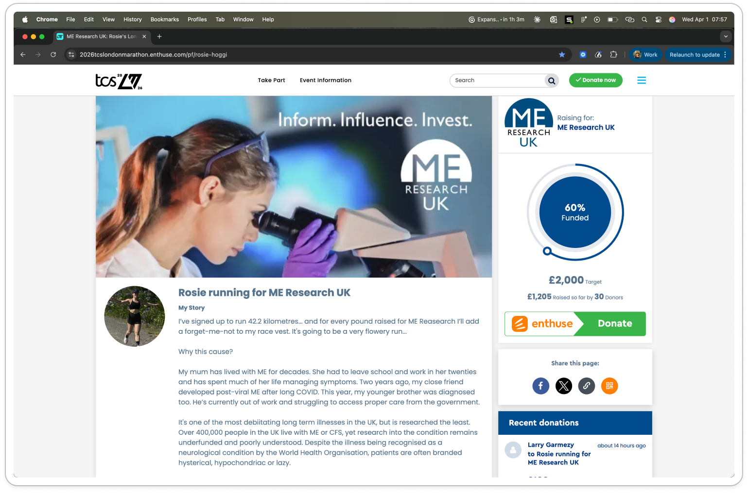
I also have to use Enthuse for my fundraising.
And this isn’t a niche tool.
As well as nailing the biggest race in the world, the platform is used by 1 in 5 of the UK’s largest charities.
The stakes are high.
As a system handling huge volumes of money, small inefficiencies compound. A small % drop off on a page means huge dollar value drop-offs in donation amount.
Which is precisely why this 13-click payment flow is baffling.
Let’s take a look step by step.
From landing page to payment
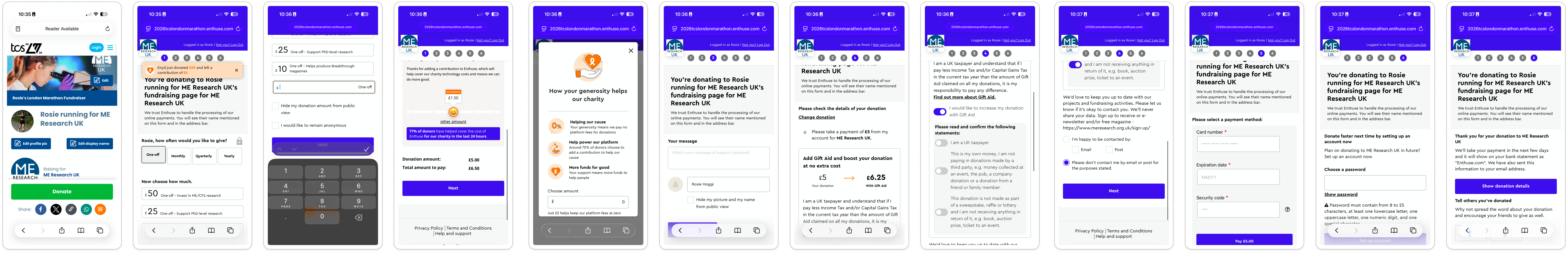
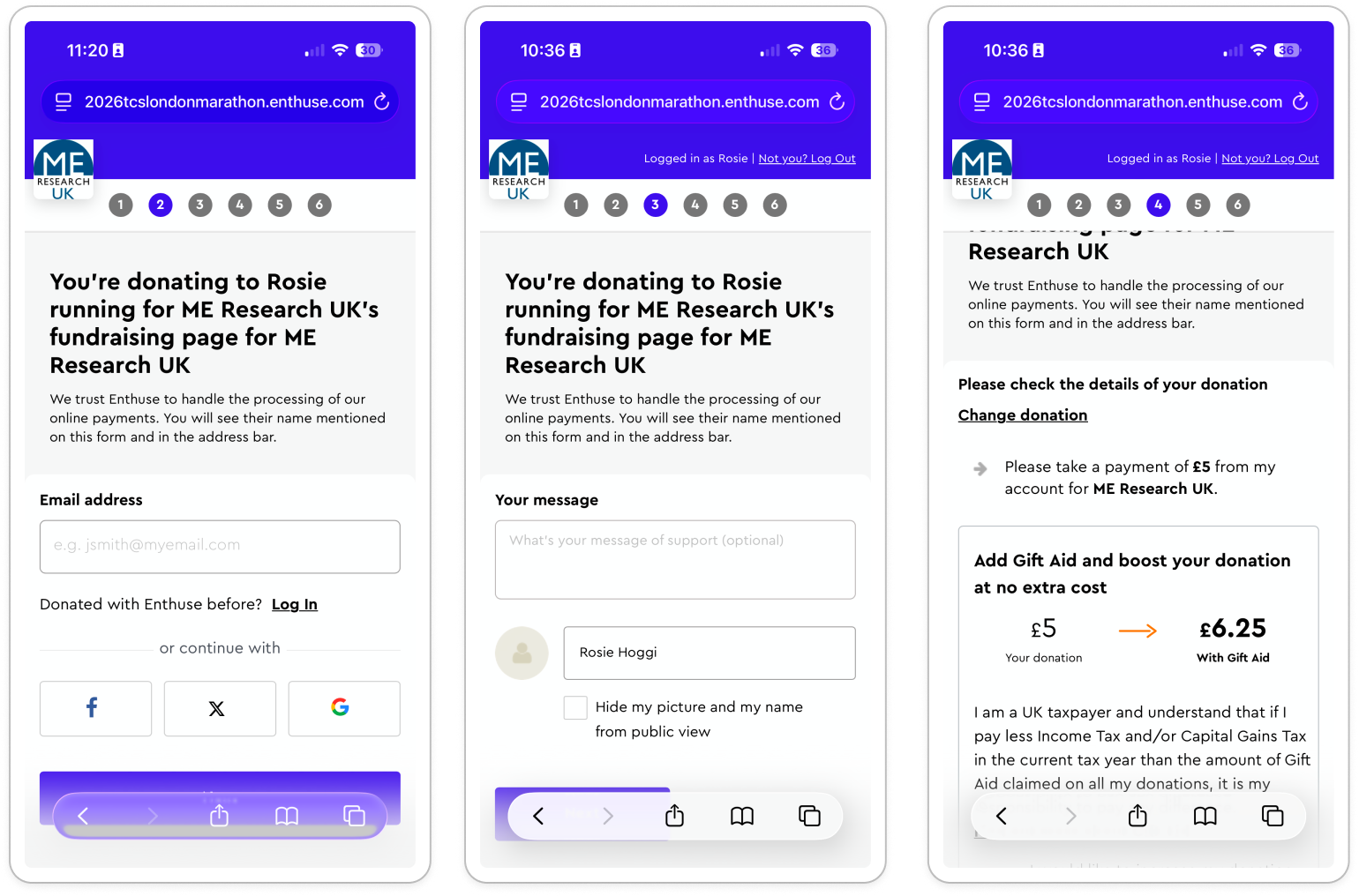
From fundraise page to successful payment, there ‘six’ stages signaled to the user:

In reality there’s eight steps in the flow:
Fundraising landing page
Select the amount
Platform fees
Create account
Add your name and message
Agree to Gift Aid
Payment details
Payment confirmation

So what should be a single action (donate) becomes a series of micro decisions, increasing cognitive load and decision fatigue.
The average adult makes 35,000 decisions every day. Hence, every additional step Enthuse puts us through is a chance for users to reassess: “do I still want to do this?”.
And it’s not just the number of steps.
Alongside the length of the flow, the second thing that confused me was the visual clutter.
On mobile, safe to say it is busy.
Many people raising money will post on WhatsApp, Instagram, Facebook - so mobile is where the majority of donators will be.
Users rely on visual hierarchy to decide where to focus, and here that hierarchy is competing with… itself.
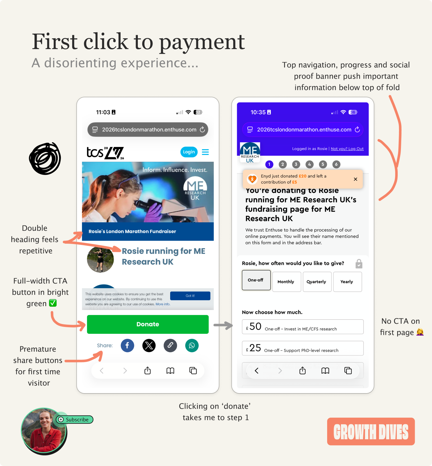
Zooming into the start of the journey, there are three big things that slow me down on these first two pages:
Excess clutter: the landing page has two titles, an image banner and avatar picture, share buttons and cookies banner, leaving a small slice for the person’s content.
Excess questions: the first question isn’t “how much would you like to give?” but “how often?”. This introduces a second decision early - risky given when users face multiple decisions at once, they tend to think ‘I’ll do this later’.
Inconsistent UI: the hierarchy and buttons change size, shape and location on each page, meaning it is hard to flick through at speed. There’s no mental model for a page here.
Even before entering a ££ amount, there’s friction.
But my people are keen to donate, so they power through.
Before long, the confusion starts to build again.
Dark UX to absorb platform fees
On the donation amount page, I keep the default to ‘one off’. Then I have to scroll down to choose the amount.
Once I’ve typed in my amount, an orange module pops up which automatically adds 30% to your amount for the platform.
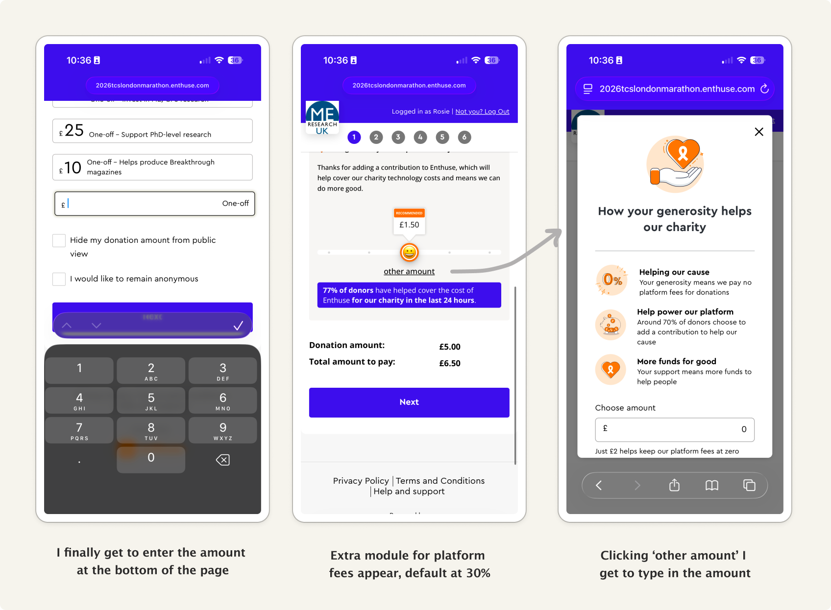
Dragging the smiley face left, the minimum it feels like you can add is 10%, until you see the hyperlinked ‘other amount’.
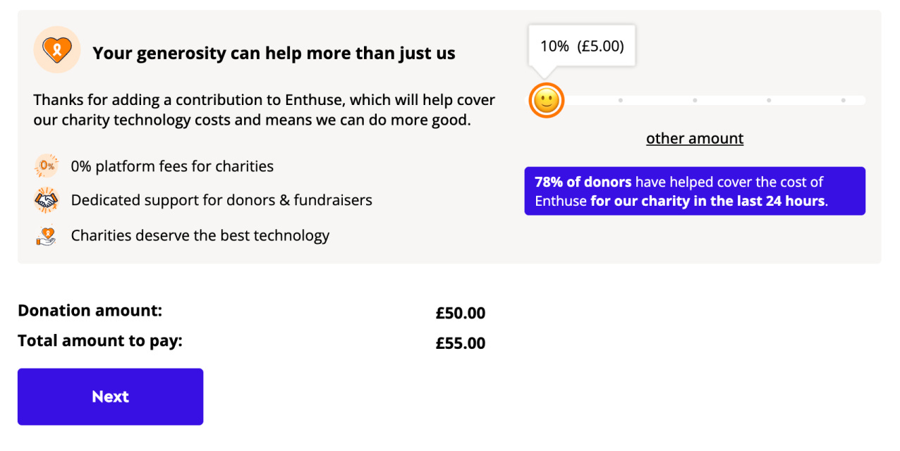
Clicking ‘other amount’ brings up a wordy page describing how the extra helps.
Within this flow, it takes me two to three steps to understand what this mystery charge is.
Unexpected costs can trigger loss aversion, where users become more sensitive to what they might lose than what they intend to give. Even when the fee is optional or justified, the timing creates friction by breaking the user’s mental model of a simple donation.
Nevertheless, I power on….
Next, I have:
Log in
Write message
Add gift aid
Which, in the copy looks like another fee:
Followed by a wall of opt-ins:
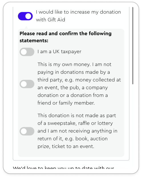
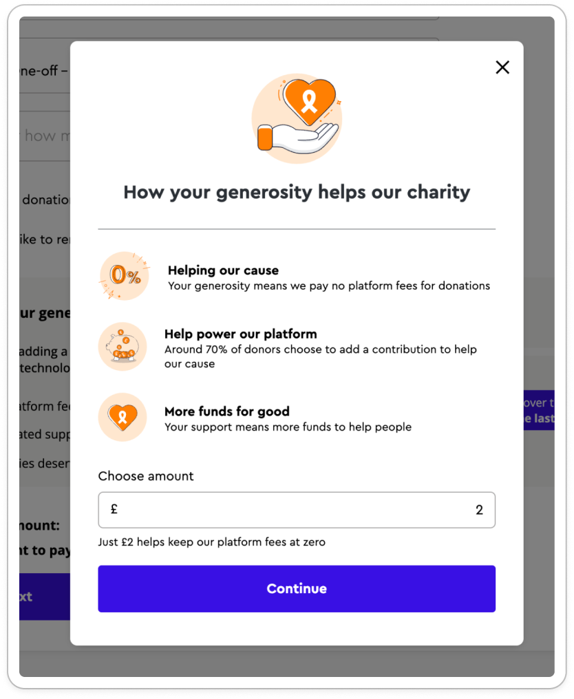
At this point, the user is presented with a dense set of options. Cognitive load is high. It feels easier to say no rather than yes. Which is bad for the charity.
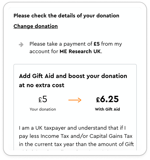
After the platform fee fiasco, I don’t trust it - but I should, as it’s just gift aid.
For the charity, gift aid adds 25% on donations made by taxpayers, at no additional cost to the payer. For a £100 donation, the charity receives £125. Though the ‘no extra cost’ on the page is hidden.
What could have worked better here is a set of simple questions:
Are you a UX tax payer?
If yes…
Add gift aid to increase your donation by 25% for free?
Great! Before we continue, confirm that: [two extra questions checking it’s not from a third party or raffle)
With nicer copy, I’d have felt less likely to be lazy and just select ‘no’.
Paying feeling old-school
After opting out of marketing, I finally crawl through to payment.
And I’m instantly deflated: there’s no apple pay.
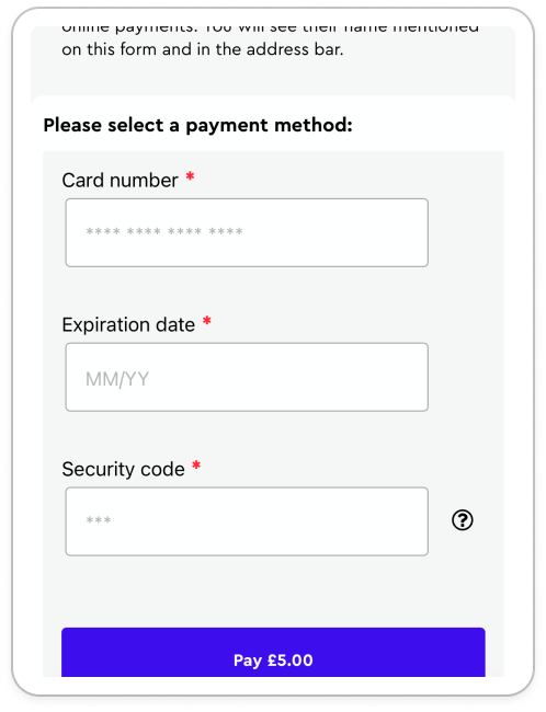
No one link, either.
So I physically get up to find my wallet. The biggest type of friction - physical friction.
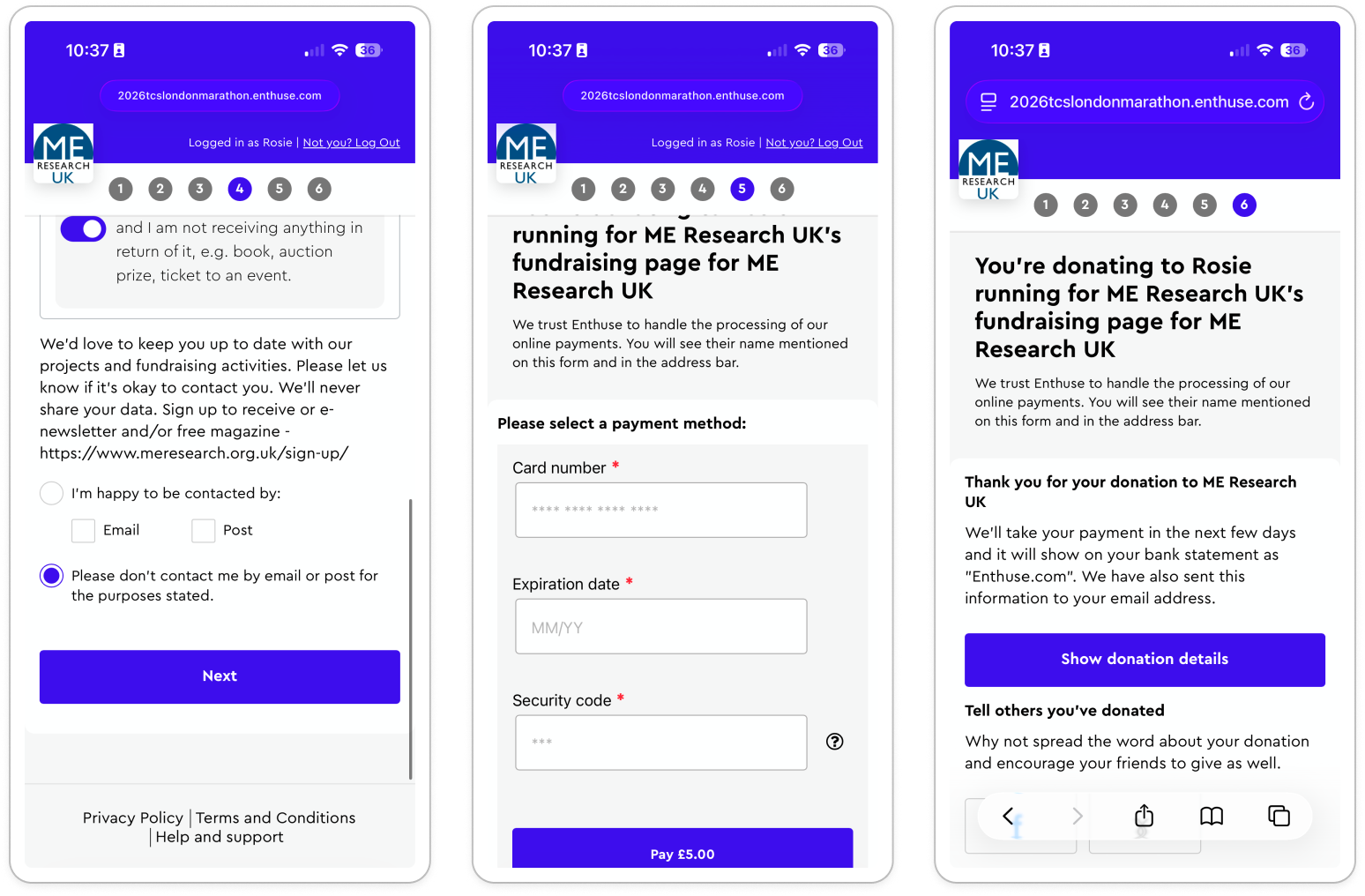
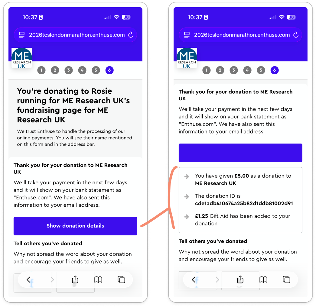
After manually typing in my details (which I haven’t done in ages) and accepting the two-step verification, I’m through. With…no confirmation?
To check the sum I’ve donated, I have to tap the ‘Show donation details’.
Very anticlimactic, I expected more of a pat on the back for that effort.
For a platform that has tens of millions passing through it I’m impressed people made it through at all. Especially people like my grandmother, my godmother and more.
Across the flow there is:
Poor mobile optimisation
Visual overwhelm and noise
Excess steps
Excess scrolling
Excess friction
Almost to the limit of feeling buggy.
But with 4000 charities using this page for 20,000 events. I doubt this is an accident.
Let’s look at why.
Why charities add friction
None of this is random.
When you look closely, the friction isn’t just poor UX. It’s doing a few jobs for the charity:
Adding default fees in there in case people don’t realize they’re giving more
Asking for log-in in a way that makes it feel necessary, but in reality it isn’t
Slowing users down just enough to increase contributions, but not enough to fully exit the flow.
When you’re adding 25% here and 30% there, the upside is so large that the friction has to be enormous to cancel it out.
Even if my godmother and family friends text me that they’re struggling, Enthuse is still probably making more from this.
This flow sits in a sleazy middle ground between optimization and obstruction.
If this flow was truly built for users in mind, it would be simpler:
Enter amount
Apple pay / one link
Boom. Done
As a fundraiser and giver, that’s what I want. Fewer steps. Clearer choices. Less thinking.
But probably… less money captured along the way.
So the real question isn’t “how did this happen?”
It’s “who is this optimised for?”
It’s not optimized for the donor trying to give £20 as quickly as possible.
It is for Enthuse: trying to earn 30% in platform fees
It is for the charity: trying to get 25% more from Gift aid. And some contacts they can warm up later in the year.
And when you frame it like that, the 13 clicks start to make a lot more sense. Even if they still feel incredibly annoying.
If you’d like to try the flow out yourself, here’s the fundraise page - at the time of writing this I’m 20% off my target!!