

The default effect: how Uber increases order value
A look at the small paywall nudges that make people upgrade

Yesterday I booked an Uber comfort for the first time. By mistake.
Turns out I accepted a default I didn’t realize was another paid tier.
My mishap came down to Uber’s default choices, personalization flow, and language. With a pre-selected tier and some option shuffling, I picked the wrong one.
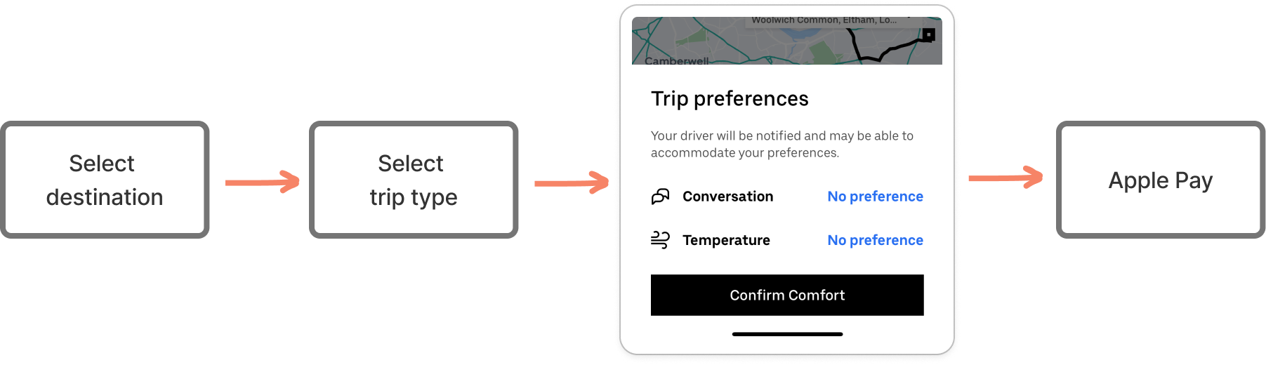
Let’s break it down and see how, in four steps, Uber increased my order value by 15%.
First, micro personalization flow that feels harmless
The first thing I remember, was seeing a small module before payment: Trip Preferences.
‘Ooh this is new’ I thought.
I head for ‘temperature’ first - I’m always too hot. And, I get carsick - especially in hybrid or electric cars. With most Uber drivers in London choosing a Toyota Prius or Tesla Model 3, I’m always in for a queasy ride 🥴
So this option was music to my ears. A cool car = less risky for sick-y.
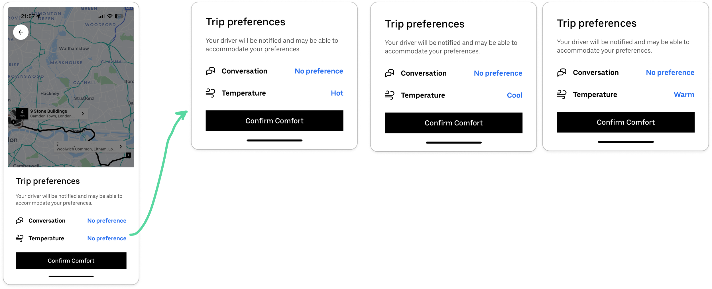
Next, I flick through Conversation, from No preference through Quiet preferred to Happy to chat. I decide to go back to Quiet preferred - it’d been a long day.
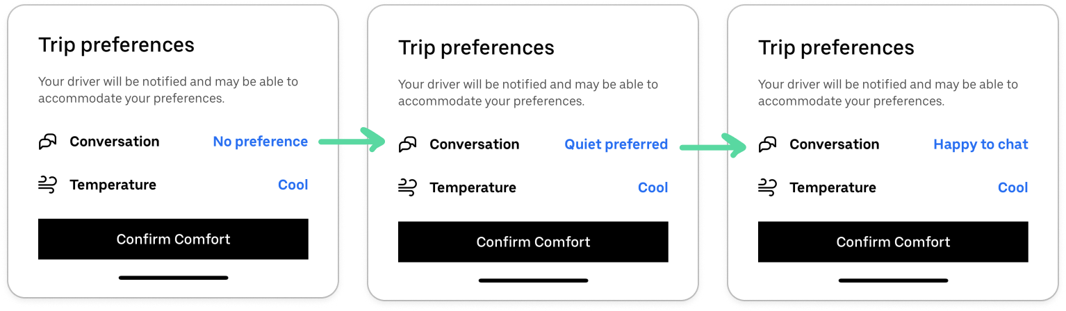
Notice how the options are single-select instead of a slider, keeping cognitive load low. The button also has a timer animation which forces me to select before it auto confirms the page, adding urgency 🧠

At this point, I’m thinking Uber has a new micro personalization feature for normal uber rides.
Little did I know I just hadn’t paid enough attention.
What’s interesting is the UX writing on the screen. On one hand, the copy is super conversational: ‘Happy to chat’, ‘cool’. Meaning it relaxes you and draws you in.
On the other, it’s very non-committal. Notice how the the sub copy under Trip Preferences says:
Your driver will be notified and may be able to accommodate your preferences
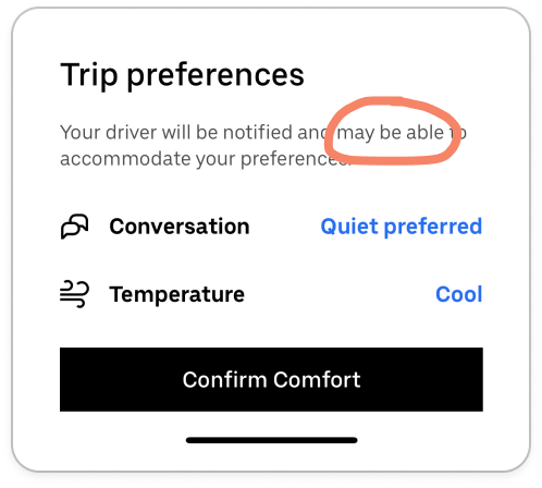
This design is made for scanning, not reading. It’s easy to miss.
Though, even if I did read it fully, I wouldn’t have cared, as I didn’t realize I was paying more for this feature 💀
The drive: a queasy ride 🚗
So, the car arrives, I get in.
It’s a normal Uber. The seat in front of me is pushed forward to give my tiny legs more room (I’m 5’3).
The driver is lovely - chill vibes, speaks when he needs to explain a diversion. Otherwise, a relatively normal ride.
He’s quiet, it’s not hot in there, but I wouldn’t say it’s cool.
I have to open the window to get cold air on my forehead. The queasiness comes in.
40 minutes later, I get out the car. I survived.
A perfectly normal ride for me, nothing special. And that’s what is odd.
The realization hits: I paid more for the same ride
While writing this article, I look at the screenshots in more detail. I ask ChatGPT if Uber always had this ‘lil personalization flow and I just missed it. To which ChatGPT promptly told me I booked a comfort ride.
Wait, what?
I check my bill and it’s right. I’ve paid for my first ever comfort ride. Thinking back, I’m stumped. What extra did I get? It felt like a tier that’s marketed different but the product experience (my ride) is the same.
I picked the wrong tier. How? I thought.
The answer isn’t hidden in the price or the ride itself. It’s in the defaults. Specifically, how Uber sets them, moves them, and asks you to confirm them.
Three UX psychology principles are doing the work here:
Mental models (the patterns we learn and expect when using a product repeatedly)
Default effect (how the top or pre-selected option guides choice)
Choice architecture (how badges and hierarchy draw attention)
On mental models, we’re used to certain layouts and UI. In terms of Uber’s pricing page, UberX and Uber Pet and my go-tos. One is normally up top, the other you have to scroll for.
However, comfort has taken the #1 slot.
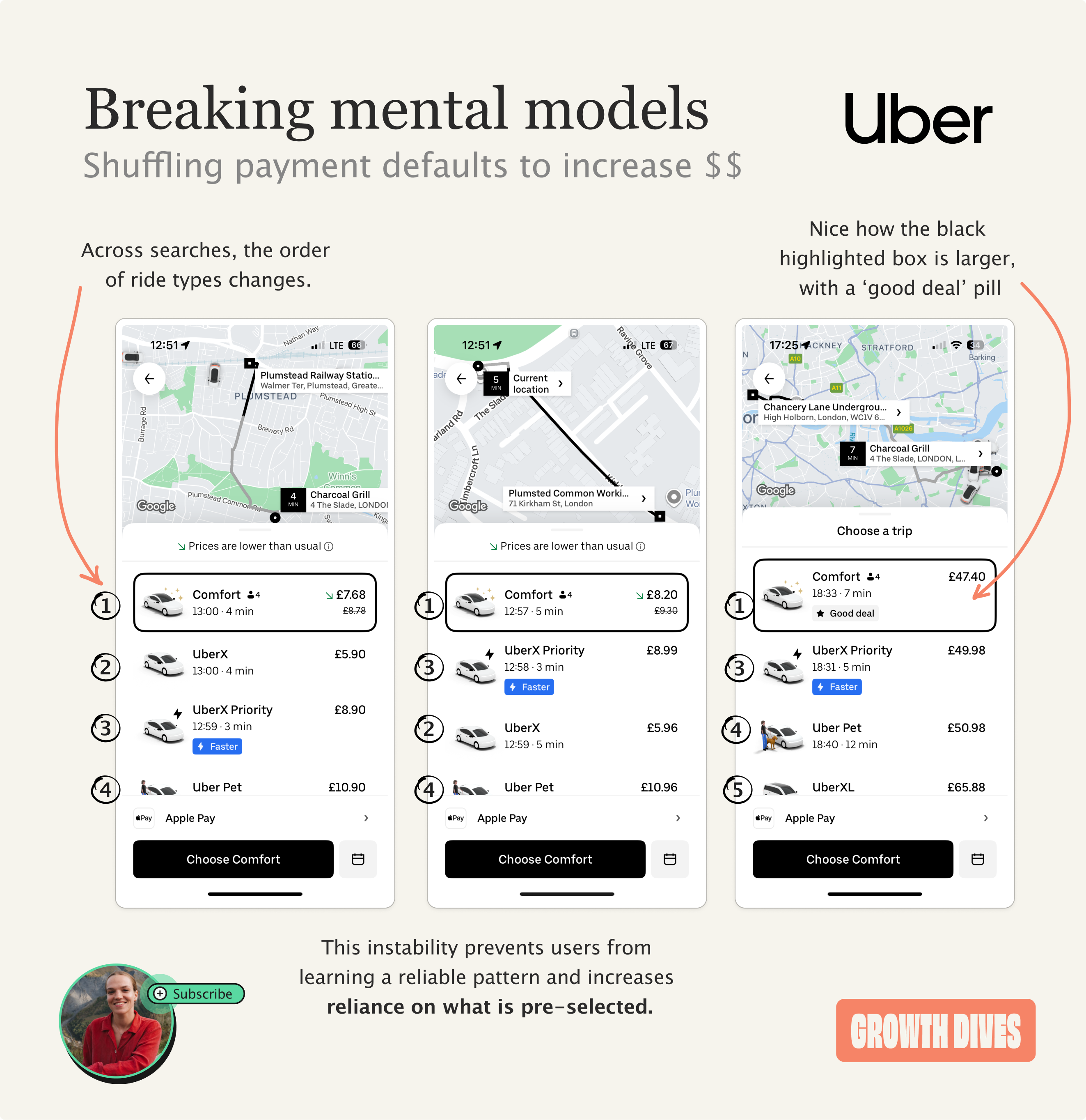
Not only that, but each option moves around. Uber X is sometimes position at 2, sometimes 3 and sometimes off the page. As a result, it’s harder to find the cheaper option, and Uber has broken my mental model of how to use their pricing page.
This instability stops me from using my memory pattern: tap, tap, pay. Causing user error.
As for the choice architecture, UberX is the most subtle tier. The others have pills for:
Faster ⚡️
⭐️ Good deal
Meaning that we’re nudged away from the cheaper tier, towards the more expensive ones.
The last thing here is not about what’s there, but about what’s missing:
No clear moment of confirmation
The end experience does not dramatically improve, so it’s hard to notice
The experience also does not fail hard enough to trigger regret or complaints - it really feels like user error (I felt like such a noob)
What’s impressive here is that many monetization tactics rely on outrage or friction. This one relies on mild satisfaction, invisible changes and forgettability. The experience failed softly, which is why it worked.
This only works because I use Uber a lot. Familiarity lowers my guard and stops me reading every last detail on a screen.
In conclusion: paywall tactics don’t have to be in-your-face
I didn’t need an Uber Comfort ride. But hey, I got one.
What’s wild is how gentle the nudges on the paywall were. Uber didn’t force me to upgrade, it just rearranged the environment I was used to, pre-selected something new and kept quiet about it.
It did it so subtly that my tired brain on a Thursday night missed all the cues. The word ‘comfort’ on the CTA, the fact I went through a comfort personalization flow. By the time I noticed, the ride was over and the decision was already behind me 🎻
This shows subtle UX writing, design choices and psychology can trick people if they (like me) don’t pay attention or use a product regularly.
Familiarity makes you fast, and speed makes you stop questioning what’s already selected.
Thanks for another great breakdown. Super interesting.
Whenever I see a UX change as with the Comfort / UberX order switch I always wonder what they are trying to achieve, as we never really know from the outside we can just guess.
It could be Uber want to increase revenues by getting more accidental taps on Comfort, but that would seem risky in the long term as it errodes trust - though great for s/t revenues. Maybe they wanted you to try a Comfort for the first time, in the hope you'd like it going forward - if so sounds like that was a fail as your ride felt the same! Maybe there were more drivers offering Comfort in the area, so you'd get a faster response by choosing one. I'm sure there are many more. Whatever the reason, it does feel pretty dark to me as we're all used to UberX being top.
Anyone working at Uber want to let us in on the reason?
What makes this work isn't just visual hierarchy—it's the copy. "Trip Preferences" sounds like customization, not upsell. "May be able to accommodate" disclaims responsibility while implying value. "Comfort" vs "UberX" language difference is doing heavy behavioral work. Content designers get blamed for "unclear labeling" but often we're asked to write copy that intentionally obscures tier differences. This is microcopy as dark pattern enabler.