

Three lessons from prototyping with Lovable
4 prototypes, 60 interviews and a whole new world

I have to admit, I was late to the game.
Lovable was founded in 2023, but last year it exploded, going from 0 to $100M ARR in eight months, then to $200M in the next four.
How-to articles sprouted everywhere, saying “if you aren’t prototyping with AI you’re doing it wrong.”
Uh oh.
Turns out I was doing product wrong for a year then…
I knew I should be trying AI prototyping but felt I didn’t have time - I was busy and working too fast to try something new. The things I was working on were quick tests, not big risky assumptions.
That was until two months ago.
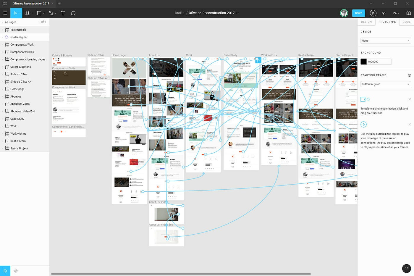
Prototyping used to mean a slow, heavyweight Figma processes dependent on skills I don’t have.
First, you need a UI design with the right layers and frames, then you need to add connections and interactions - one by one. This can easily take over a day (especially if it’s your first time).
In one role, I suggested prototyping a product bet. The response from a seasoned designer was: “that takes too long.”
So, for the past few years I found a workaround.
Something fast, scrappy, and good enough.
Google Slides 😆
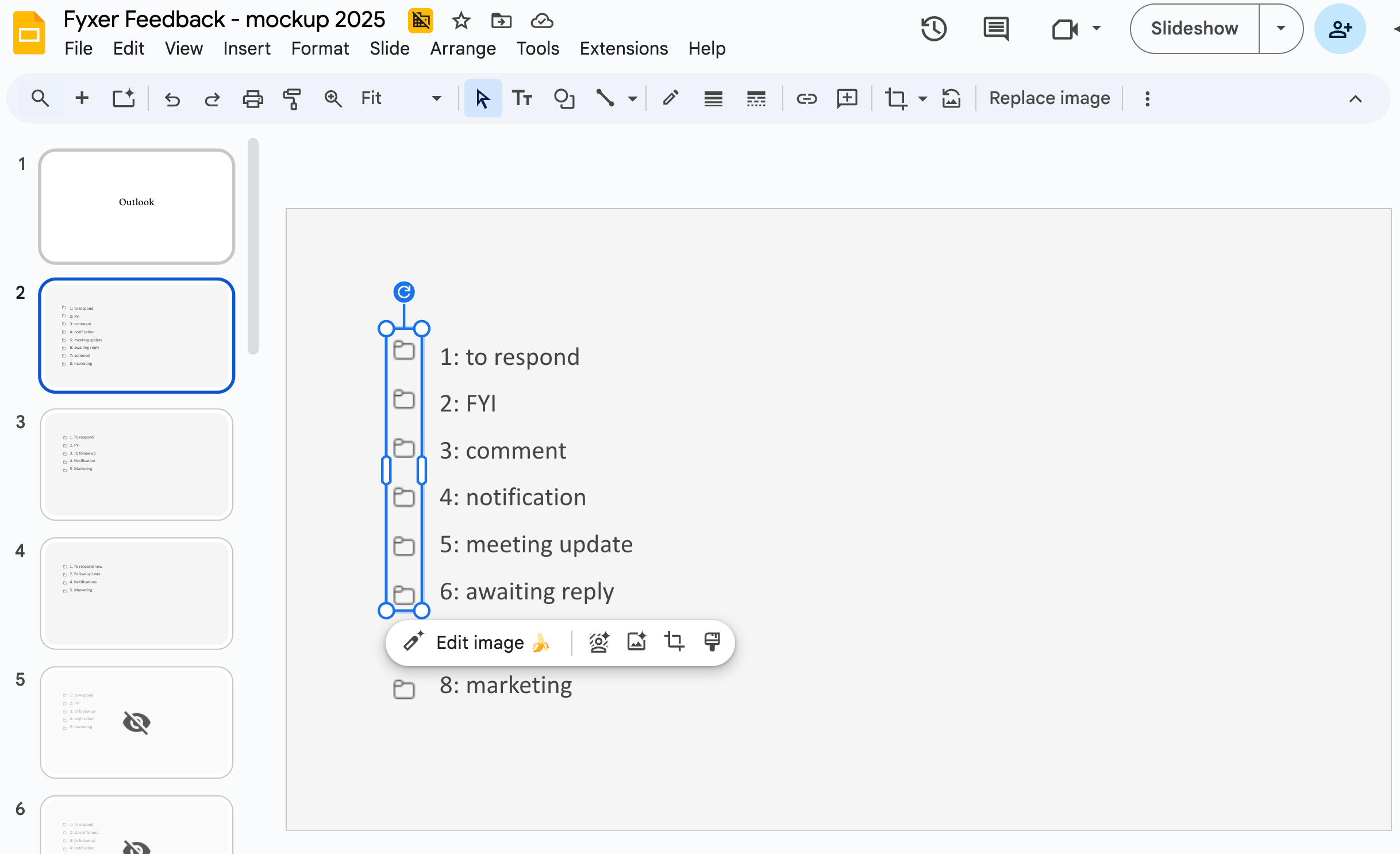
It is not interactive but it let me test ideas with real users on the same day. I stuck with that approach until it stopped me learning.
In November, I had a customer insight at Fyxer that I wanted to validate. But the underlying problem was technically hard.
I started the same way: take screenshots, add fake text, cover up some bits (ta-da you have a slide prototype). After showing it to eight users I had learned:
Customers understanding of the current UX writing
What’s unclear, what adds value, what doesn’t
What would they remove or add
Their gut reaction to a pre-conceived version 2, and a version 3
What the words mean to them
That got me a long way. But then I hit a wall.
A static prototype won’t show you flows, curiosity, or whether someone will try a feature on their own.
I thought: It’s time
I knew I needed something interactive.
I typed ‘Lovable’ into Google.
Here’s what happened.
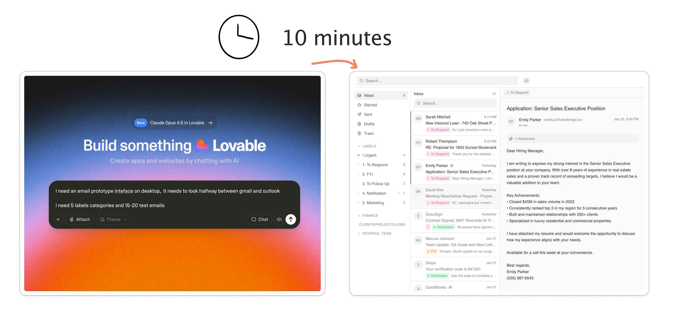
Time-to-prototype: 10 minutes 🏎️
Time to first action was quick. Very quick.
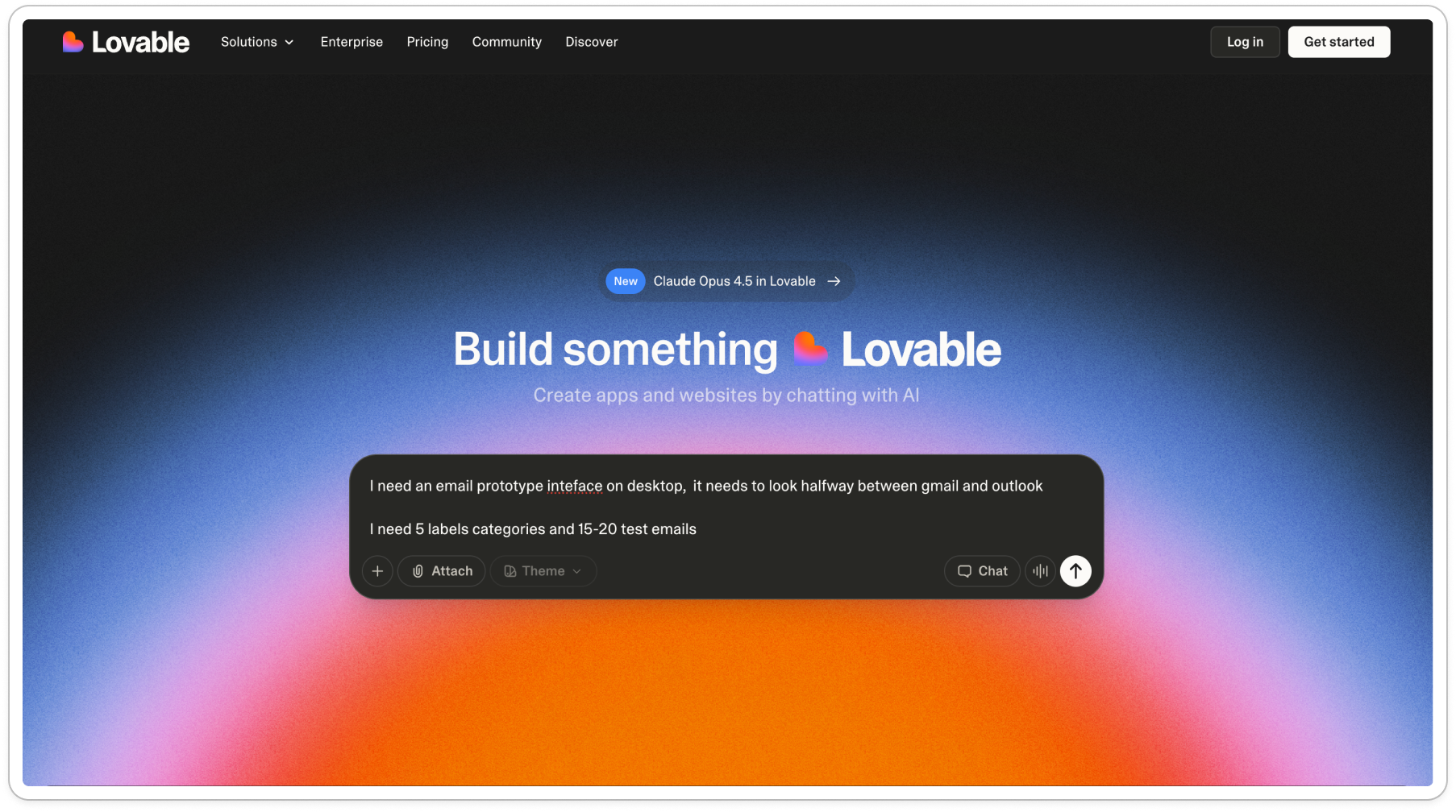
On Lovable’s homepage, I got to the AI chat and started typing.
I always start with zero-shot prompting. What this means is I don’t say how to perform the task; there’s instructions without providing any examples of desired input/output pairs. I like testing how good the first output can be without much direction.
In this case, here’s my first prompt (misspellings and all):
I need an email prototype inteface on desktop, it needs to look halfway between gmail and outlook
I need 5 labels categories and 15-20 test emails
The categories are:
(I list out 1-5)
The 15 emails are common emails for someone working in [industries]. I list out examples.
In the main inbox, I don’t want to see marketing. That gets sorted away. In the sent folder there needs to be some sent/actioned mail.
it needs to be able to be interacted with. Click into emails. Read them
After which, I was sent through a lightweight onboarding before I could see my new baby:
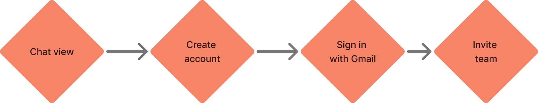
The onboarding didn’t feel like too much friction: it was short and stayed out of the way. Account creation happened in an overlay, not a separate flow, so there was no sense of “starting over” or being '“taken away” from the flow.
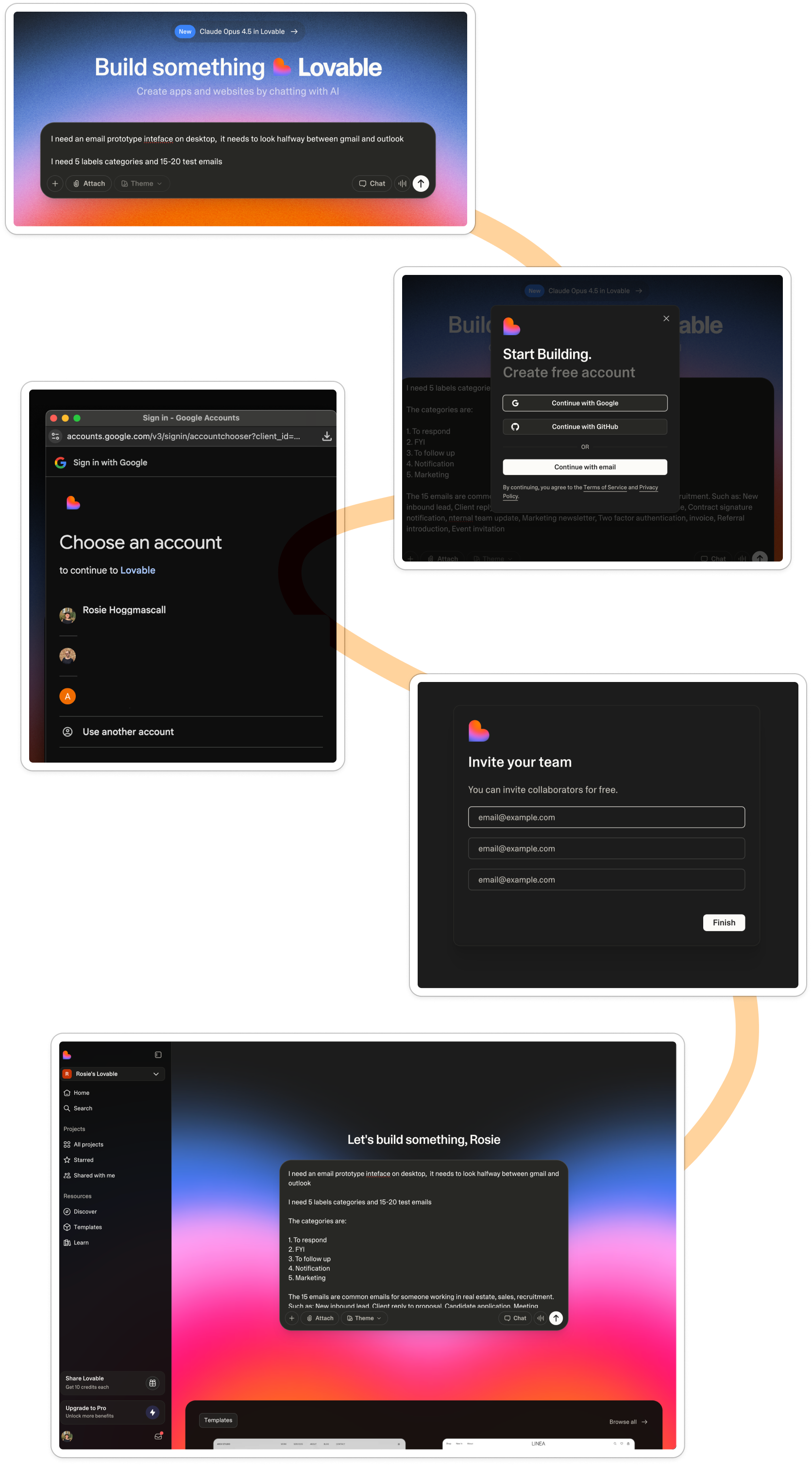
When I landed in the workspace, it looked almost identical to the marketing site. Same black GenAI chat over a pink gradient, creating a new mental model for what my building space looks like. They’d added a sidebar and some personalization:
Build something lovable
Became
Let’s build something, Rosie
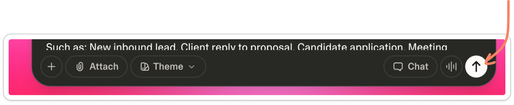
My prompt was already there - nothing to retype or set up. I was one click away, all I had to do was hit the little arrow and generate.
And it really was just that easy.
As I waited for Lovable to spit out my new baby, it told me it’s process:
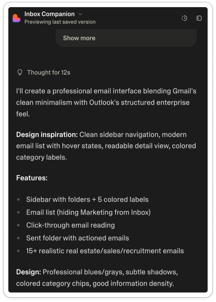
Here it’s building trust with me:
Tell me the process
Share your logic so I can check it
Take me through the underlying assumptions
Don’t generate too fast else I won’t trust the quality
With the ‘thinking’ UI, I could see what it was doing, which helped me build confidence that what I was going to see was backed up by some design thinking. It was almost like a mini PRD (product requirement doc) with: features, design inspiration & design approach.
After a few minutes, my first version appeared:
End-to-end, I went from landing page to first prototype in as little as six clicks.
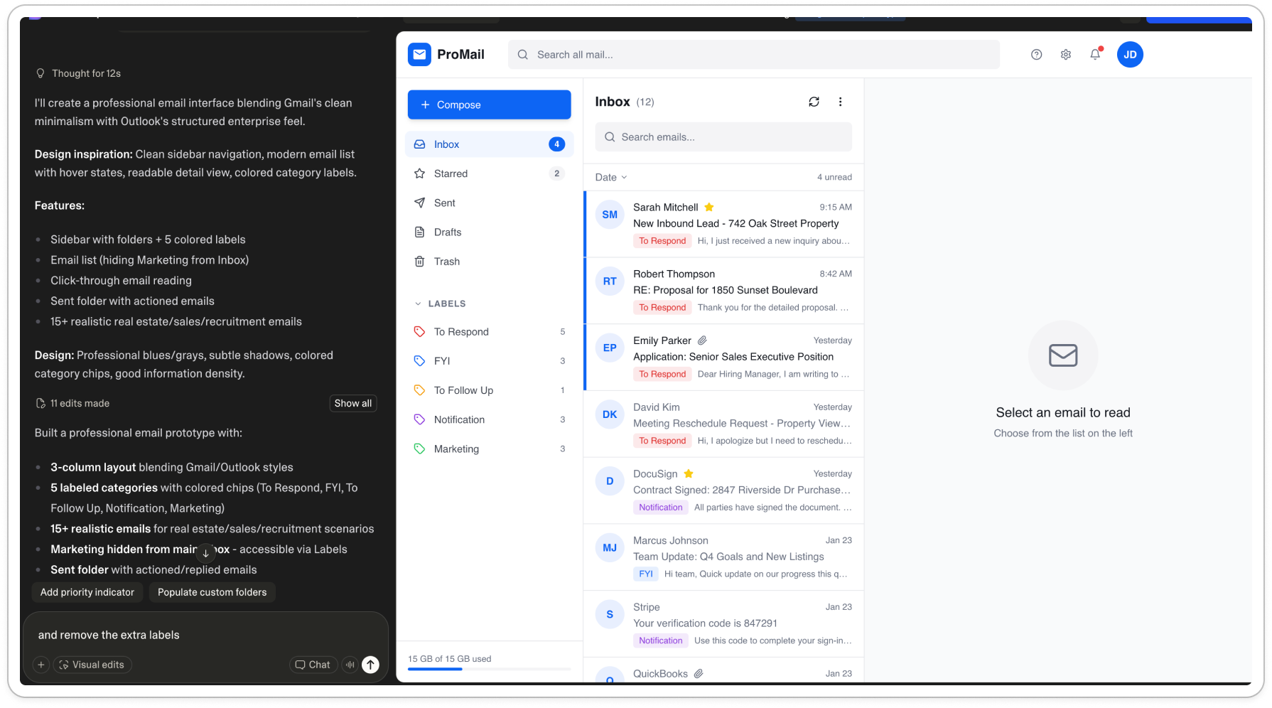
What surprised me most was not how cool the feeling of building was, but actually how well it took feedback.
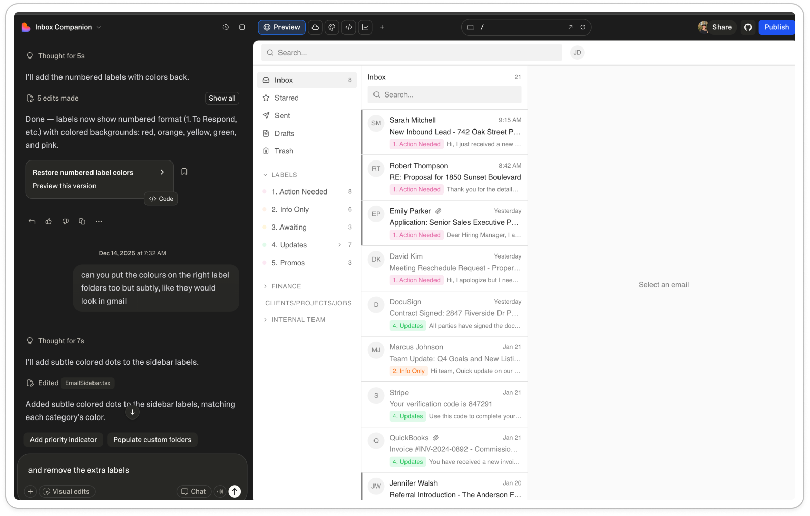
I followed up 16 prompts to edit, like:
Can you remove ‘pro mail’ remove any detail like settings notifications. Make it super simple, It needs to look really lo fi, any more lo fi you can make it (remove the blue and make it grey)
The labels are squished
Bring the label colors back, with need to have the numbers and full stop
Can you put the colors on the right label folders too but subtly, like they would look in gmail
Can you add 10 more sample emails that a real estate or recruitment person might receive
The labels are not working - when i click on the folders they should then show in the inbox
These aimed to remove distraction but keep the essentials, and make sure the basic interaction worked.
Of all of my 16 edits, Lovable managed to make the exact edit with one instruction. Like when you have a very intelligent intern who just ‘gets’ it.
The only area where I needed to keep chasing was color. Where in the end, one of our product engineers recommended that I give it an actual hex color code:
Can you make the to respond label dot this color : #FFA1A8
This process took around ten minutes.
In terms of product activation, in ten minutes I had:
Gone from marketing site to fully working product
Taken the first action
Reached my first magic moment (first generation)
Reached my second magic moment (how quick to take in feedback the prototype was)
I was in a place where I was happy to share this with an interviewee. Which was great because I had five lined up that very same day.
Publishing to production = easy peasy 🫛
Very quickly I was on to magic moment number three: deployment.
I assumed this step was where things would slow down. I’m used to hearing of PR reviews, merging branches, staging environments, production rollouts. Which all scream: this takes time.
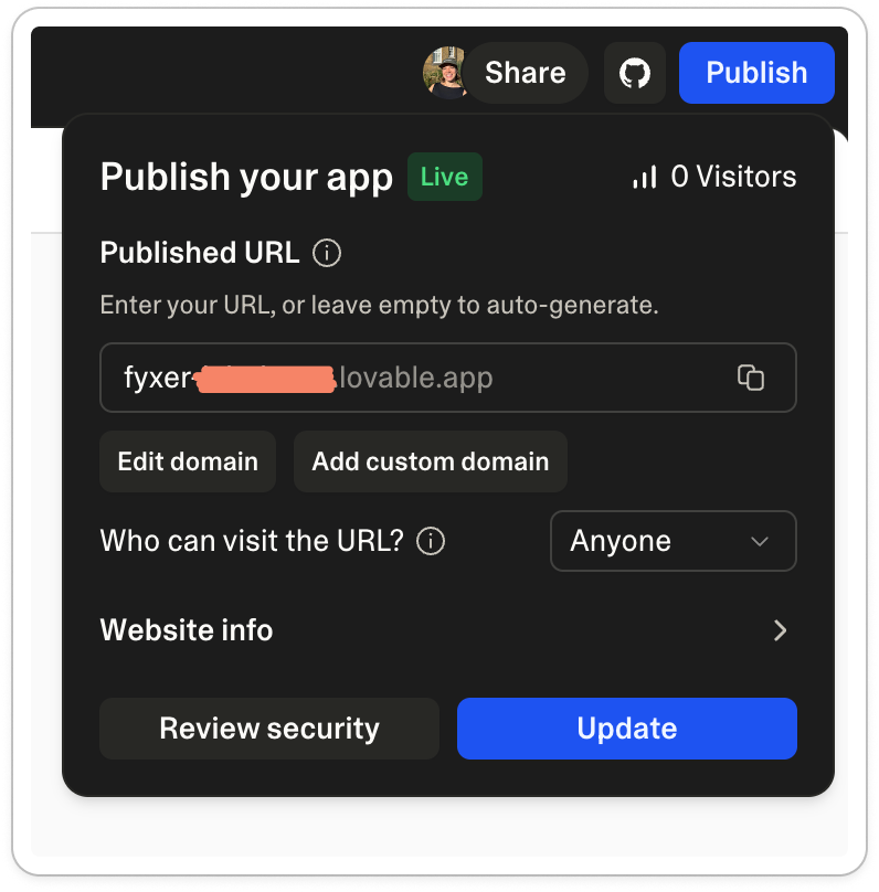
Whereas in Lovable, I hit “publish”, the big blue button top right.
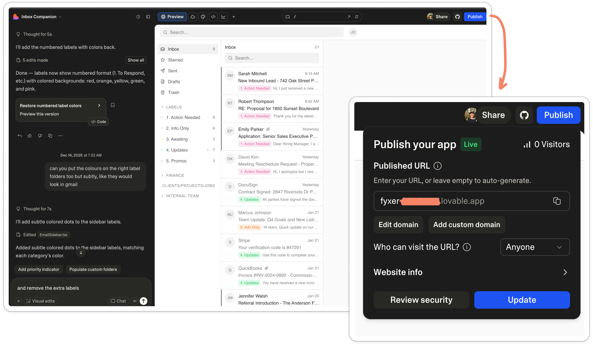
And that was pretty much it. I saw the little ‘live’ pill confirming my baby had in fact been shown to the world for the first time.
I copied my link. Pasted it into a new tab and voila, my living breathing prototype was there.
Having started this task at 8.29am, I had a working prototype before 9am. It was easier than creating a slide, and 100 times more ‘real’.
Which then brought a the next challenge.
The hard part: a moving bottleneck 🍾
With this new prototyping-as-fast-as-light skill unlocked, the building of the prototype suddenly stops being the hard part.
The real challenge is now downstream: assumption testing. Asking the right questions, silence at the right moments, and knowing what to notice versus ignore in what you’re seeing.
Even with a great prototype, if you say the wrong thing you can lead people and collect the wrong data.
With the first few prototype interviews with my new Lovable baby, I start testing like this:
Frame it loosely: “I want to show you a rough, interactive mockup. It’s not a design, just a way of exploring an idea. I’m going to paste a link in the call chat, and I’d like you to click that and share your screen”
Then wait. Watch what they do first (if anything). Where do they click. Where do they hesitate. Where does the cursor hover. Count to ten before saying anything.
Gut check: “Can you talk me through what’s going through your head?”
Action: “What would you do next if this showed up for you, if anything?”
Note down their questions: What are they asking? What distracts them? What stops them from trusting or acting?
Finally, look for gaps: “What feels missing or risky here?” And, “If you didn’t have this, what would you do instead right now?”
After the first two or three interviews, I made edits to remove distractions in the prototype and improve the examples. As soon as you remove distractions, you start to hear the real insights.
After five of the same type of person, you typically stop hearing net new insights.
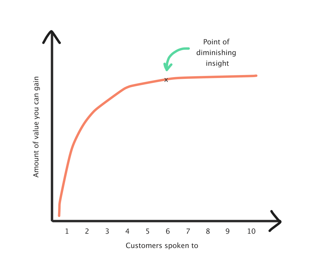
That can take longer if you’re iterating the prototype a lot, or testing across multiple industries or ICPs. As a rule of thumb, you’re aiming for five relevant, similar customers. Even with screening, you’ll lose a couple, so it often means speaking to around seven to get five good ones.
So, after edits, iterations, and a second prototype on a new topic, two months later I’ve:
Done 60 + customers interviews
Across 2 slide prototypes and 2 lovable prototypes
Tested 6 assumptions
Made edits on the go, between calls
And created a new workflow that’s easier, more valid and more accurate than my previous one.
What surprised me most wasn’t the tool itself, but how much it changed the way I work. Less time messing around with the ‘what’ I was going to show, more time learning and talking to customer.
Now that’s a win.
To conclude: the next challenges of testing
The moment my google slides were no longer fit for purpose was the moment I had to level up. But realistically, a lot of people won’t be there yet.
I worry that framing AI prototyping as a marker of a “good” product person risks shaming people into doing research they don’t actually need. Not every problem calls for a prototype, and not every prototype needs to exist.
But, if you:
Have a problem is technically hard, politically sensitive, or expensive to reverse
Have no behavioral or quantitative data
Hear stakeholders debating hypotheticals over and over
Have multiple viable routes and want a quick gauge on which one could land best
Want to reduce risk before committing to build
Are building a product vision that needs to get people on the same page
Then I’d highly recommend spending 10 minutes on Lovable.
And when you do, there’s three things to bear in mind when you start:
Lesson 1: Get something in front of people ASAP.
Imperfect is fine. What matters is getting something interactive in front of people early, before you’ve talked yourself into or out of an idea. Don’t spend ages on all the details, as you never know what people think or focus on before you start.
You can edit and change as you go, and once you’ve reached an MVP prototype that’s:
Not distracting
Tests your core assumption
Has relevant defaults for your ICP
Then you need five customers to test your hypothesis.
Lesson 2: Write your assumptions down before you test
Fast prototyping removes friction but it also makes it easier to test the wrong thing. Have a hypothesis with the underlying assumptions written down in Notion, Linear, Slack (whatever) before you start. Something like:
What’s the big bet?
What’s the hypothesis?
What are all the risky assumptions?
For example: Search
What’s the big bet? People want to find what they need by searching, rather than navigating through menus.
What’s the hypothesis? If we add a fast, global search, people will complete tasks quicker and feel less frustrated. This behaviour change will impact commercial metric (retention).
What are all the risky assumptions?
People think “search” before they think “browse”
They know what to search for
Results are meaningful without extra context
Search is faster than clicking through the UI
Existing navigation isn’t already good enough
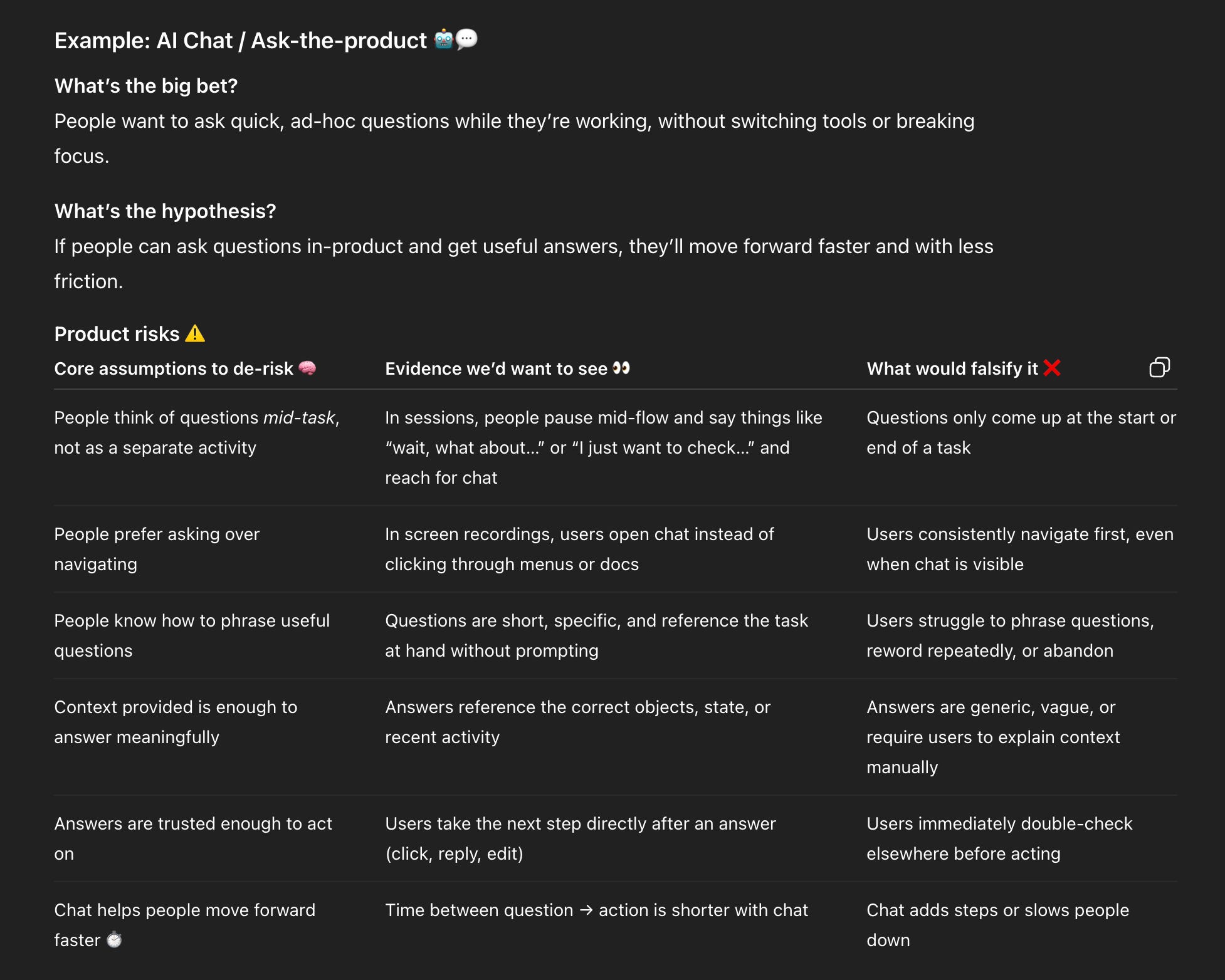
I’d recommend adding what information would falsify the assumption. I normally do this in a table and use ChatGPT as a sparring partner. For example, if the big bet was AI chat:
Lesson 3: Spend more time on your interview script than on your prototype.
With faster prototyping, the quality of what you learn depends much less on the artefact itself and much more on how you run the conversation around it.
If your interview plan is weak, you will just get to the wrong conclusion faster. The same prototype can give you completely different outcomes depending on:
How much you explain upfront
Whether you interrupt hesitation
Whether you lead people toward an answer
What you treat as useful insights vs. ignore
Spend some time sparring with ChatGPT, ask for feedback on your script:
What are the best things to ask here?
Am I leading anywhere?
What am I missing that I should be looking for?
I often ask: “Imagine you’re an expert UX researcher coaching me” to start off the prompt.
If you’re unsure, test on a colleague first or a partner. Practice makes perfect.
And, that’s it!
Let me know how you get on, I’d love to know what you’re researching and how if you want to share.
Thanks for reading this week’s Growth Dives 🫶 Next week I’m going to run through the next bottleneck: interview capture and analysis, with a new shiny tool I’m using called Dovetail.