

When onboarding isn't enough.
How Slack activates users months after signup

I was in Slack yesterday when I saw this lil’ pop-up:
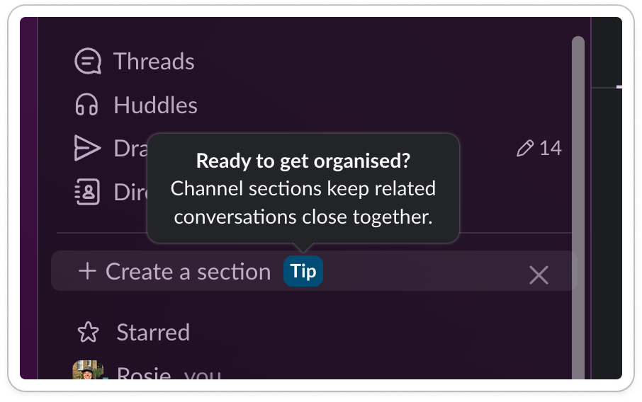
Ready to get organized?
Hell yes I am. My slack is a mess.
My sidebar is like a stock market floor, different bits screaming for my attention. Channels are either too alive or too dead. I know I’ve missed some things but I have no idea where they are.
Instead of clicking it, I paused.
How did I get here?
I use Slack every day. I onboarded years ago. I know the basics, I’m pretty hot with the search bar 😏
So why do I feel so chaotic?
I’ll tell you why.
The dark side to productivity tools
Productivity tools have a weird side effect: they create more work.
Take Notion. How many half-built systems do you have? Dead tables? Orphaned pages?
Customization = choices. And with choices comes human chaos:
Notion gives you infinite structure.
Slack gives you infinite channels.
Airtable/Sheets gives you infinite databases.
Customers end up creating admin debt.
And contrary to popular belief a great onboarding rarely solves that.
Better onboarding isn’t the answer
Onboarding is often seen as the ‘one shot’ you have to activate users.
The thinking goes: customers arrive, their brains are like goldfish, you either win them or you lose them in that moment.
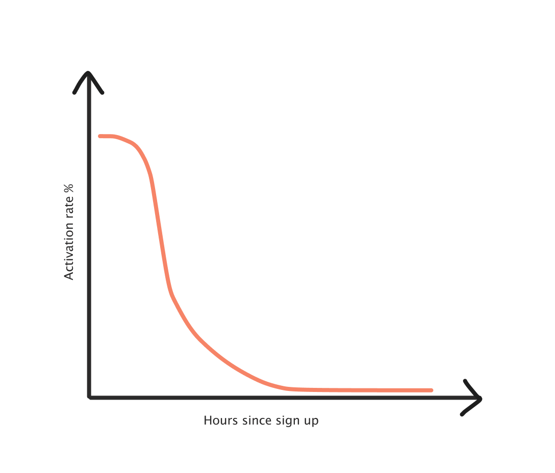
After the first 24 hours, a user has gone from newbie-learning mode to get-stuff-done-mode. If they haven’t grasped features that help them use the product well, they’re unlikely to retain as well.
By the time users actually see the mess they’ve created, onboarding is long over.
This creates a churn risk, and a value proposition risk. It’s easier for new startups to come in and clean up the mess:
Tired of [insert old solution]? Try [better solution].
Products need to intercept that negative adoption spiral, before customers start looking elsewhere.
How?
The answer is:
Intercept users at the right time
Convince them to try out the feature
Allow them to adopt the feature with ease
Something which Slack does regularly.
So, let’s see how it does it.
Step 1: Intercept users
The best way to get in front of users is to be in front of their eyeballs. Sounds obvious, but the amount of modules that are hidden in the UI….
Slack goes for the top spot on their sidebar to introduce me to their VIP feature.
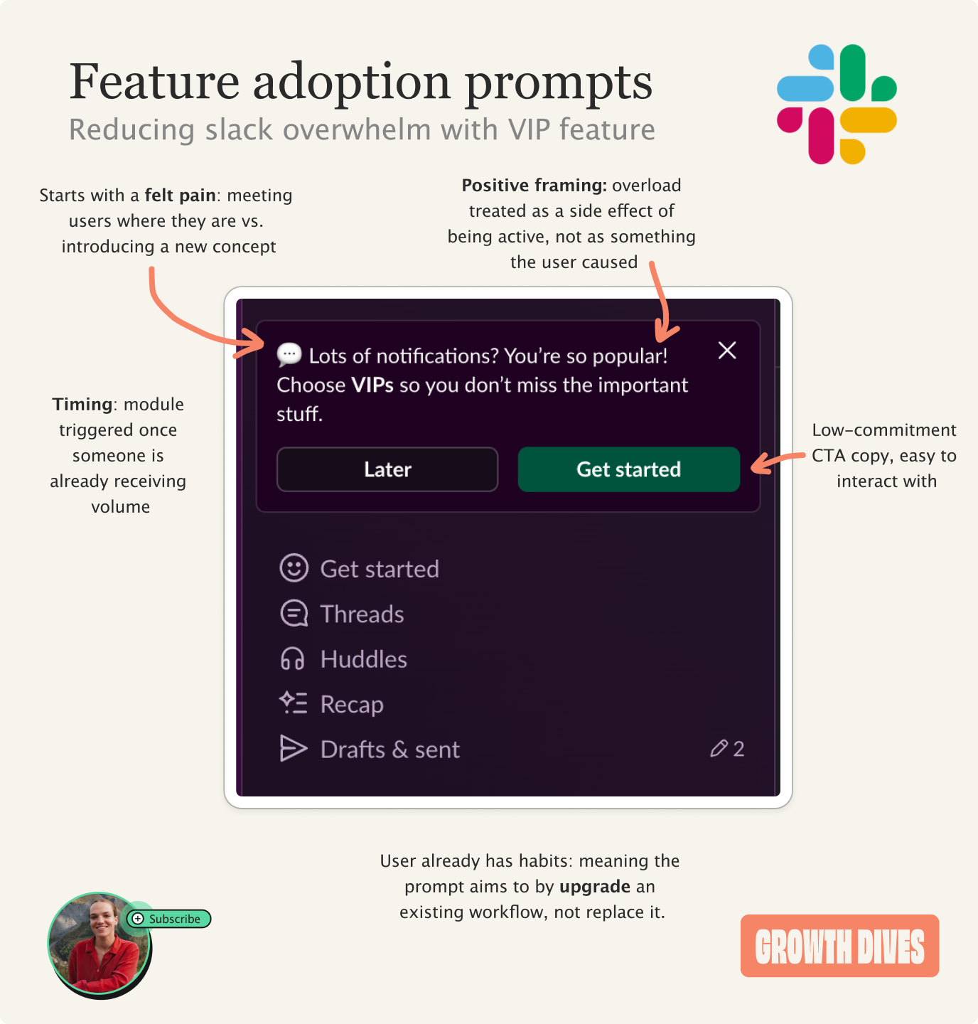
What I love about this example is the copy. I don’t get shamed for not trying a feature, Slack simply says:
Lots of notifications?
Yes, so many
You’re so popular
Oh why thank you.
And then the call to action: Choose your VIPs so you don’t miss the important stuff.
Notice how this module is:
Framed positively
Feels like a level-up vs. a shame ‘you haven’t tried this’
Makes me feel seen and important
Has a ‘later’ button, which is a low friction exit (not a hard ‘no’)
Feels light and easy
What this means is that I’m softened as I read it, and I’m more likely to click.
A second place to intercept is in the middle of a flow.
Take this module, which asks me to use Slack’s grouping feature as I join a new channel.
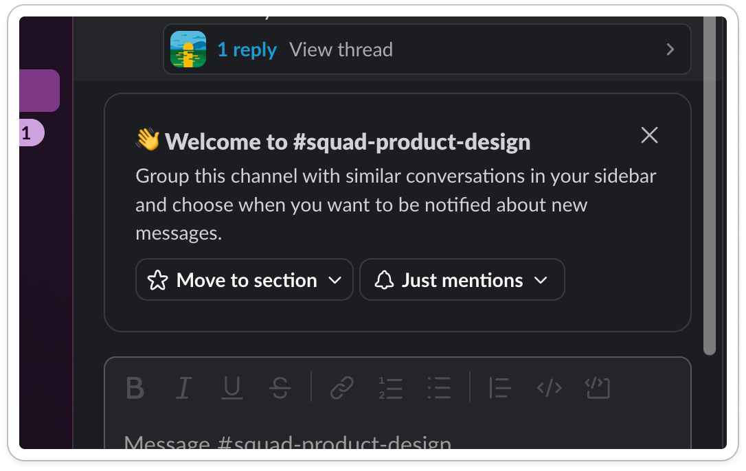
Slack has picked this moment because I’m in a flow and this feels relevant. Every time I add a new channel, the risk of noise becomes greater. So I should tidy.
The same goes for this hook: Scrolling for something you might have missed?
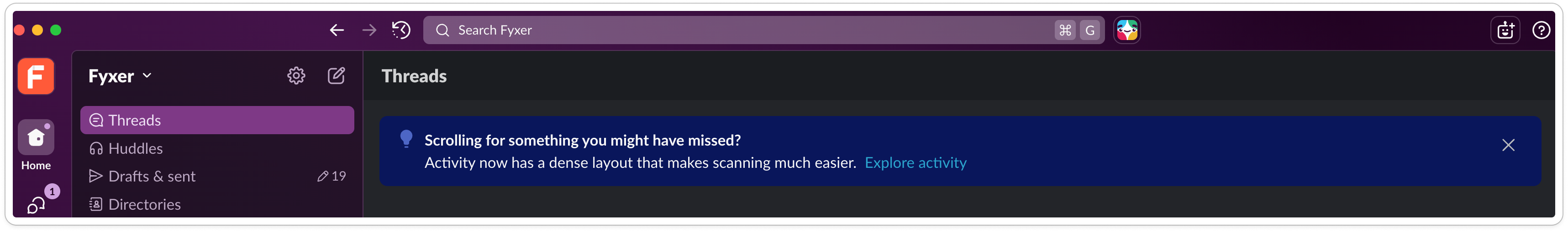
Jumping in at the right moment means the issue is top of mind.
But intercepting is only half the battle.
Now you have to make me care.
Step 2: Convince
We are creatures of habit, and months or years into someone’s usage means they can be resistant to create new habits. You have to convince them.
Slack does this by:
Making the copy feel personal (even if it isn’t)
Styling out the ask
Making it feel easy
Take this module. It feels like Slack has done work for me by analyzing my channels and identifying I need to tidy them up.
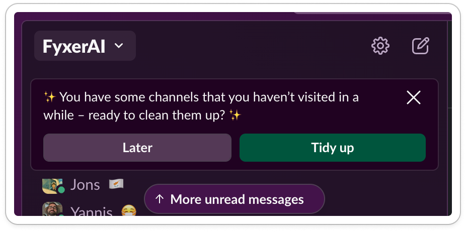
This is the reciprocity effect (I do work for you, so you do work for me).
Sneaky.
It’s also amusing: the emoji’s make it look like my fairy godmother has appeared to tidy me up for the ball ✨✨
On the topic of fun, another way to convince is to gamify.
In another session, Slack gives a three-option question at the bottom of my nav bar:
Want a productivity boost?
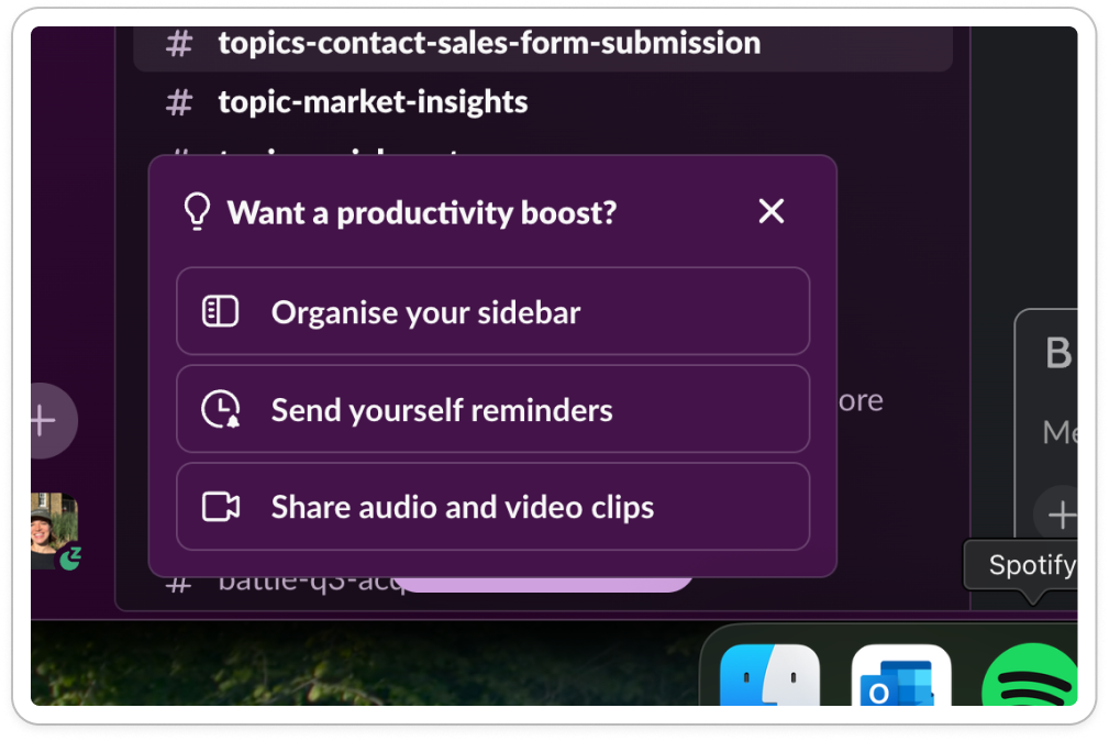
What’s satisfying about the design here is:
The headline is prominent and clearly framed as a question
Icons support each option, making the list scannable
Button-like containers clearly show interactivity
The copy is all action-oriented ‘organize’, ‘send’, and feels inviting versus demanding. There’s a hint of a task list here, making me feel like I want to try them all and get that dopamine hit.
What’s key is to rotate your modules - some are tactics that work great the first time, but become noise with time. A gamified quiz question gets boring if overused.
But even if I click, the job isn’t done.
That’s where adoption comes in.
Step 3: Adopt
Once you’ve managed to convince the user to click on a new feature, you need to make it incredibly easy to follow through.
Slack does this by bringing the settings forward into the module, and keeping flows short. Take this example feature:
Slack introduced me to a new feature ‘dense mode’ through a popup
I clicked through the carousel telling me what it was
At the end of the carousel, I was offered to change the setting then and there
The friction to try it out was minimal, meaning it took me a few seconds to give it a spin.
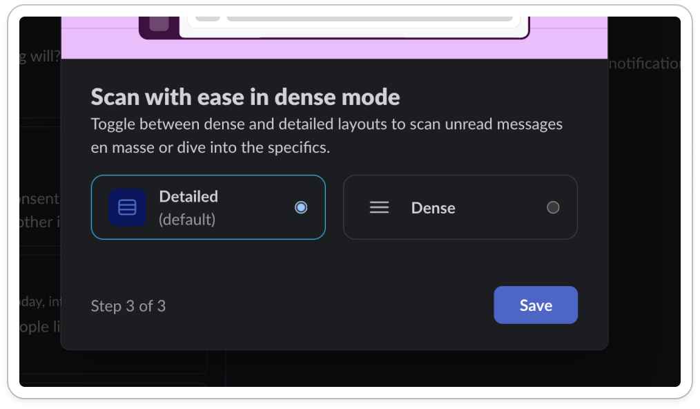
Notice how this UI gives me:
Two options
Clarity on what’s the default vs not
Save button as the only next step
The only challenge here is that I can’t see my view change as the pop up takes up 30% of the screen.
Stepping back from the individual modules, there’s something bigger going on here.
Takeaways on post-onboarding adoption
This isn’t about tooltips, it’s about preventing churn.
It’s about those moments, months down the line, when doubt creeps in. When you wonder whether the product still works for you.
My favorite thing across all these examples is the positioning. Slack doesn’t tell you you’ve failed, it’s assuming that confusion is inevitable.
Slack knows I’m overwhelmed.
As a result, it can honestly design for my second wave of learning, noise reduction and focus.
If you’re designing for feature adoption, here’s six things to try from the Slack example:
First, try the obvious: put something right in their line of sight. But if you do, make sure the copy actually speaks to them vs. promotes your own agenda
Second, try a prompt in a journey, ideally where the pain is felt (so it is top of mind)
Mix up the pattern. If every nudge looks like every other module, people stop seeing them.
Write in a way that reflects how your user sees themselves. Slack doesn’t talk to me like I’m incompetent. It talks to me like I’m busy and important and just need a bit of help filtering the noise.
Do some of the work for the user. Don’t just say “you could organize this.” Show them what needs organizing. Make a recommendation. Reduce the effort before they’ve even clicked.
Make the onward journey incredibly easy, so that the user can try it with ease
Seen other good post-onboarding nudges? Let me know if the comments ⌨️ ⌨️ ⌨️
Till next week 🫶