

Why Claude feels more human
The psychology of first impressions in AI

This is a Growth Dives Mini today: 60-second read, practical learnings - super fast 🏎️ 🏎️ 🏎️
Why does Claude feel like a barista whereas ChatGPT feel like the ice king?
Same product. Completely different first impression.
There difference is black and white (or black and orange):
Warm vs. efficient
Human vs. mechanical
Conversational vs. clinical
What’s impressive is there isn’t a huge amount of UI to play with here.
This classic chat screen has been designed, copied and optimized to death over the last few years. The structure is almost identical everywhere: input box, centered headline, black or white minimal background.
Same layout. Same components.
So the differentiation is not the structure. It’s the details.
Let’s break it down.
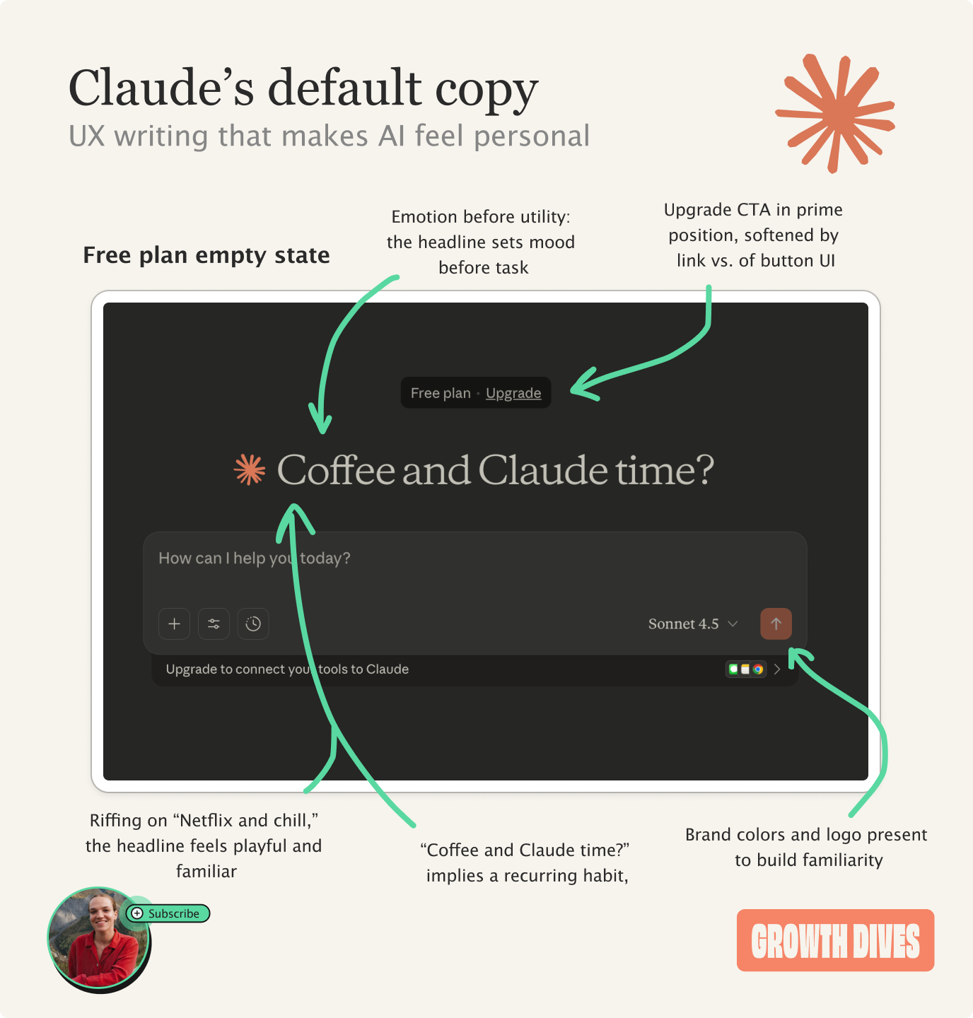
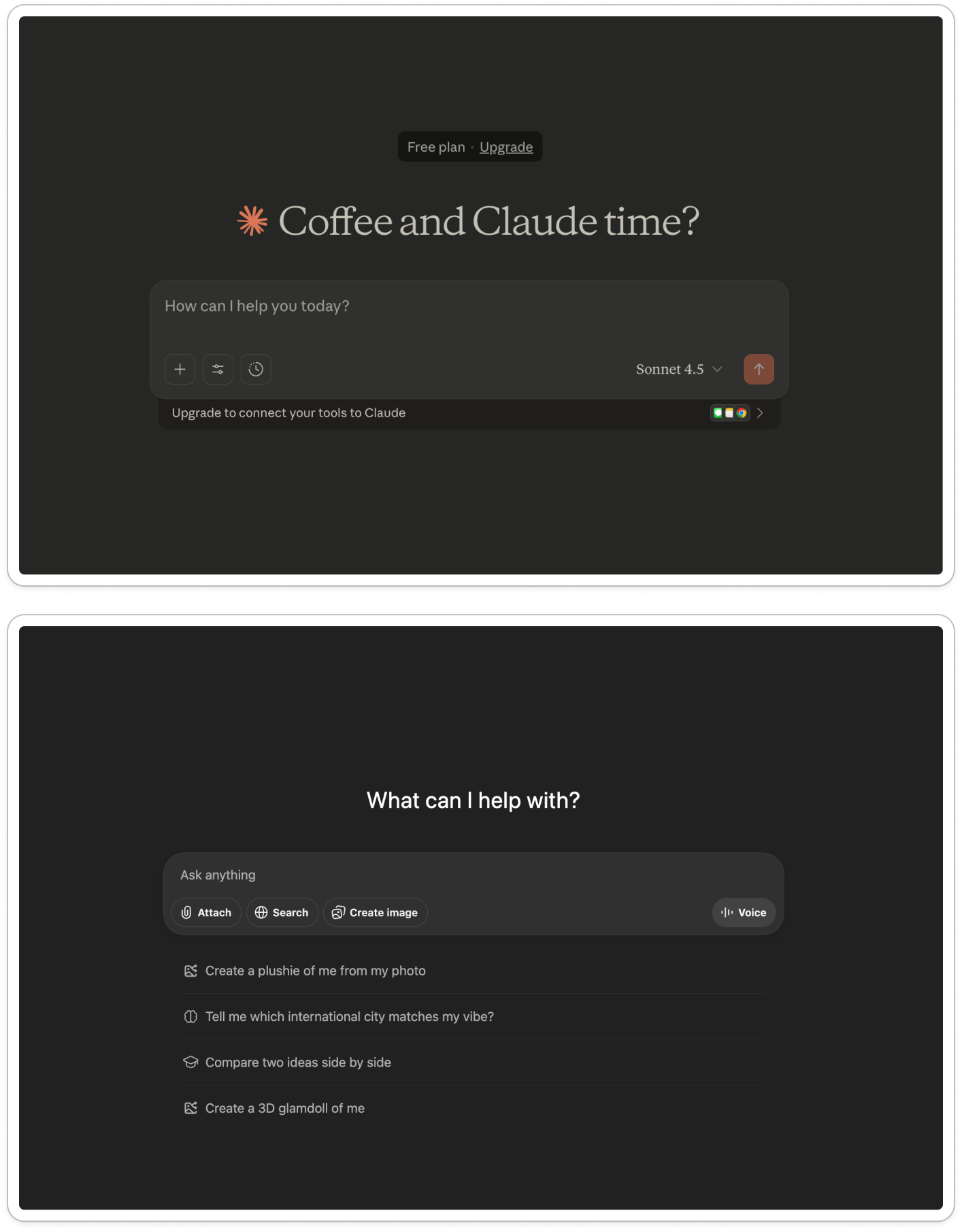
With Claude:
The headline is in a Serif font = instantly more soft and human.
The greeting is large, while the input prompt is understated.
“Coffee and Claude time?” creates the mood before asking for a task.
The copy humanizes by using first person ‘how can I help you today?’
The logo mark sits inline with the headline, warming the page with the orange.
The two upgrade CTAs are visible but softened, meaning they feel low pressure rather than sale-y.
The overall vibe is about emotion and connection, not transaction - which feels inviting and fun.
Whereas with ChatGPT:
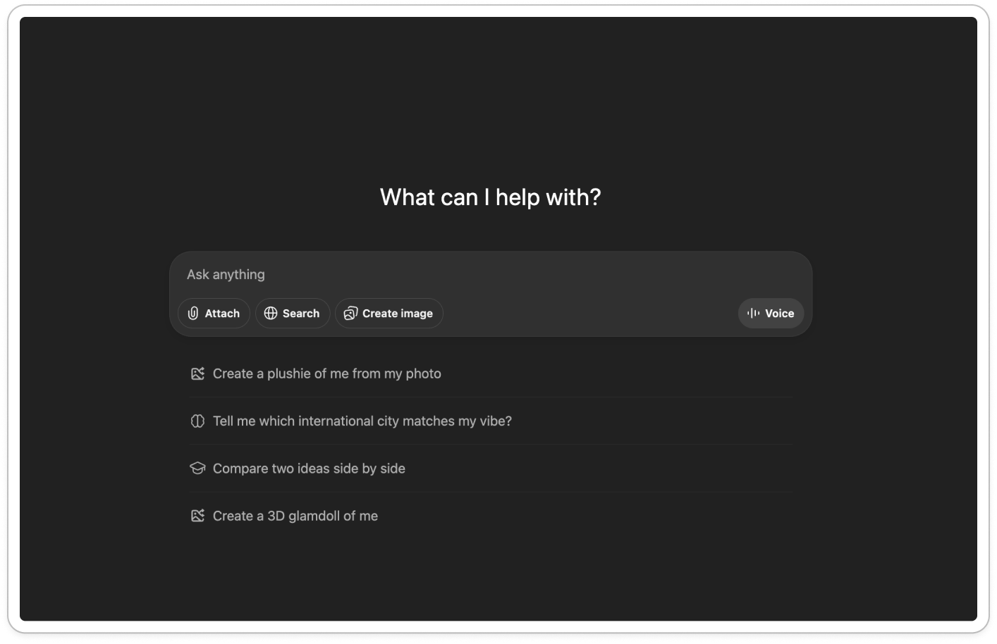
The sans serif type feels clean and efficient.
Black and white UI feels no-nonsense and minimal.
“What can I help with?” jumps straight to the task. No mood setting, just utility.
The copy is brief, neutral and functional ‘ask anything’ - sounds like a system not a person.
The input box is a larger part of the the screen compared to the header, showing that function comes before introductions.
Action buttons are central (Attach, Search, Create image, Voice) showing off the capabilities.
The overall vibe is transactional, not relational. It feels ready to get sh*t done.
This UI is optimized for output, not atmosphere.
Now compare that to warm, fluffy Claude.
A vibe which continues through the paid experience:
Happy Friday, rosie
Good morning, rosie
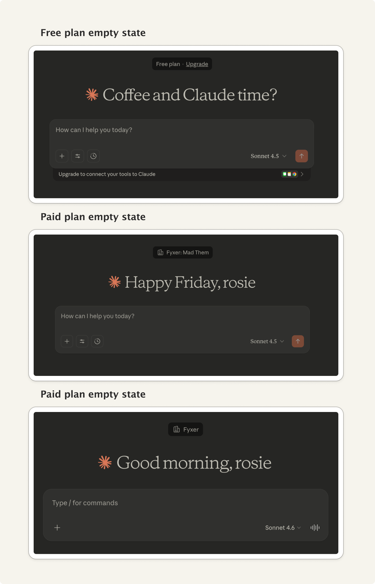
Not just simple name personalization, ‘rosie’, it acknowledges time of day, day of week, where you are in your rhythm.
It makes me feel like Claude is aware and considered, instead of static.
Just like a warm, friendly barista.
On designing tone, not just UI
Whether you have a huge amount of UI in your product or not, what matters is in the details. When deciding what your first moment looks like, consider:
What’s the first sentence your product says?
Does it set mood, or just state function?
Are you building a relationship, or just enabling a task?
Where does emotion sit, above the input or below it?
Does your typography and color palette signal warmth or precision? Does that match your brand?
Are you designing for habit, or just usage?
What your product says first matters. The relationship starts earlier than you think.