

Trust in Agents: a case study of Attio Workflows
The UX of handing over the work, not the control

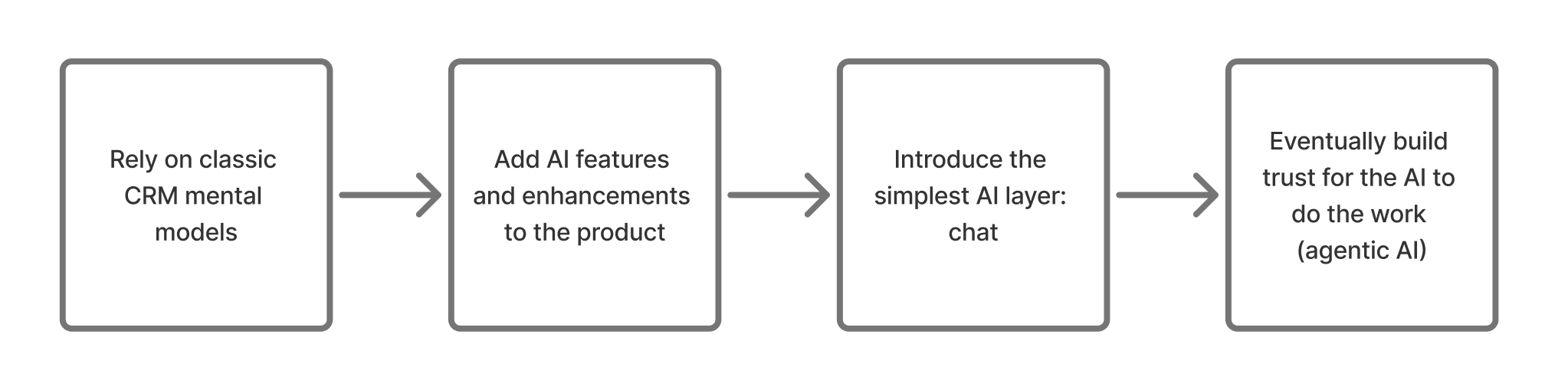
Three months ago, I wrote that CRMs had started to think. The article ended on a four-stage timeline - from classic CRM, to AI features, to chat interface, to the AI eventually doing the work for you:
When talking about the future of AI, Notion mapped the same journey; thought partner, to assistant, to teammate, to running the whole system:
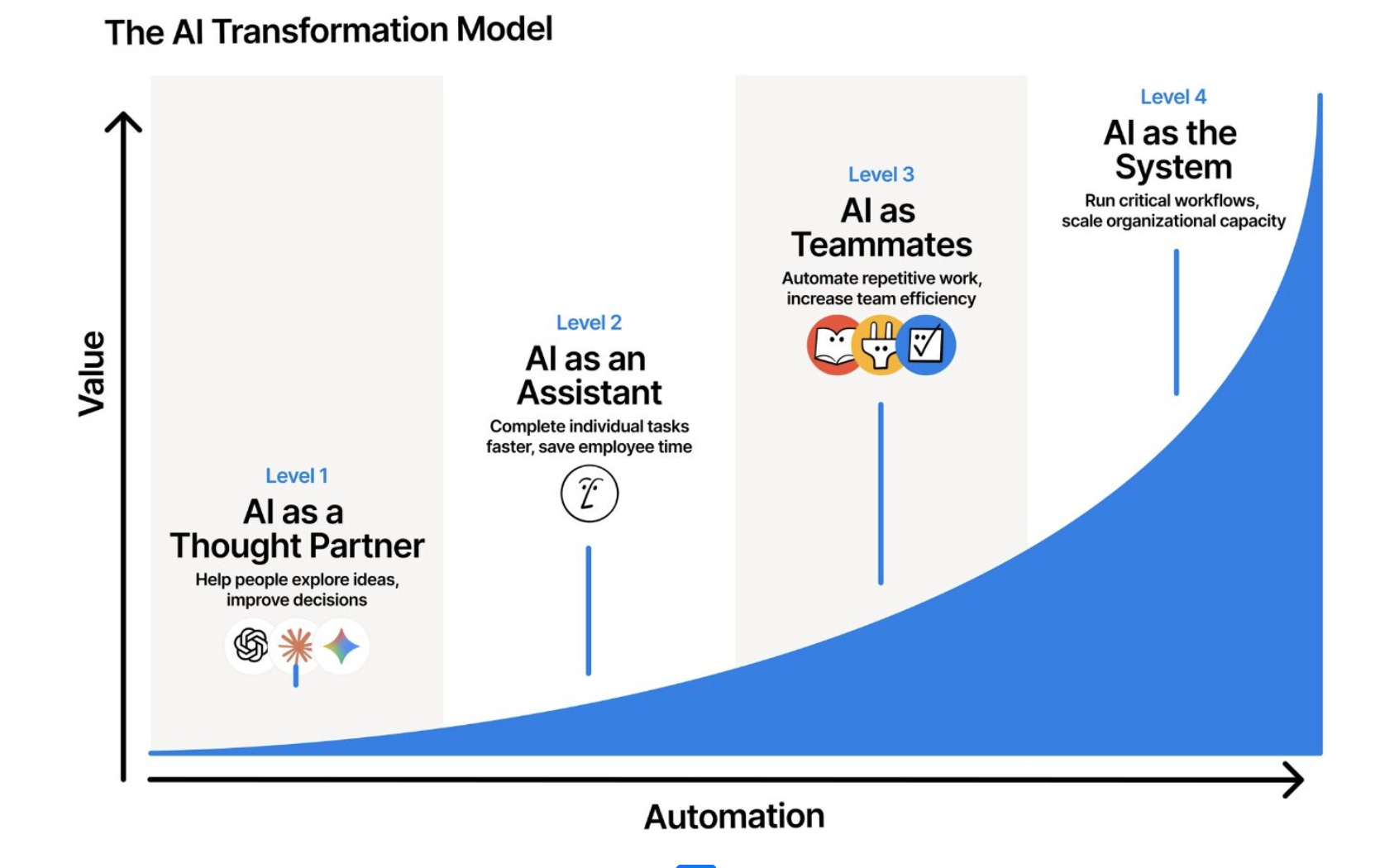
At the end of both, the product ends up doing the work, not just helping with it.
And, as of today - 24 June 2026 - it feels like most products have arrived 🎉 So many tools have an agent now. Which sounds great, except there’s a catch…
The more you ask something to do, the more it can get wrong. If I hire an intern, do I hand them the company card on day one?
Nope.
So, the real question isn’t whether a product can build an agent, it’s how they get customers to trust it enough to feel ‘OK’ with trying it out.
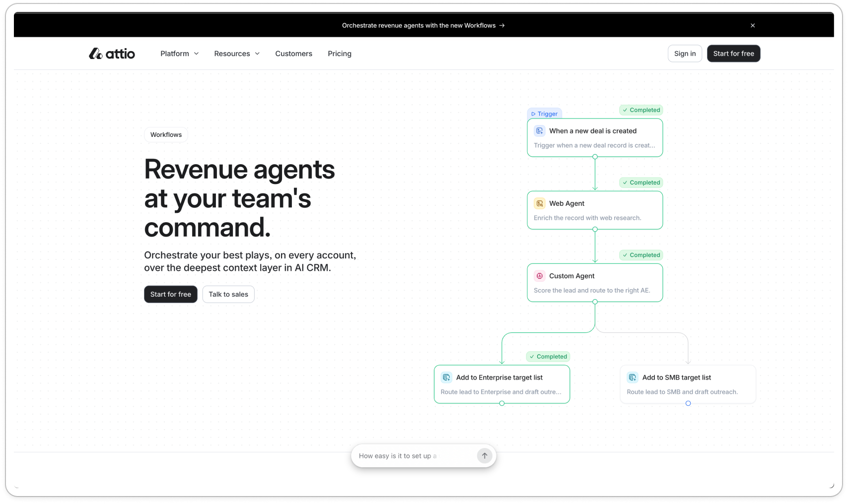
Enter: Attio Workflows.
Look closely and the trust is developed in four ways:
Discovery: You gotta drive people to the feature first
Defaults: design defaults that match the user
Proof: showing the working
Sign off: clarity on draft states, and when they’re live
Starting with discovery - because if they don’t get there, nothing else matters.
First, drive users to the feature
You can’t trust a feature you never find 🫠
Many new features die because they’re hidden two layers deep in the navigation.
The first thing I notice is where Workflows is pushed for the first time: in the onboarding checklist.
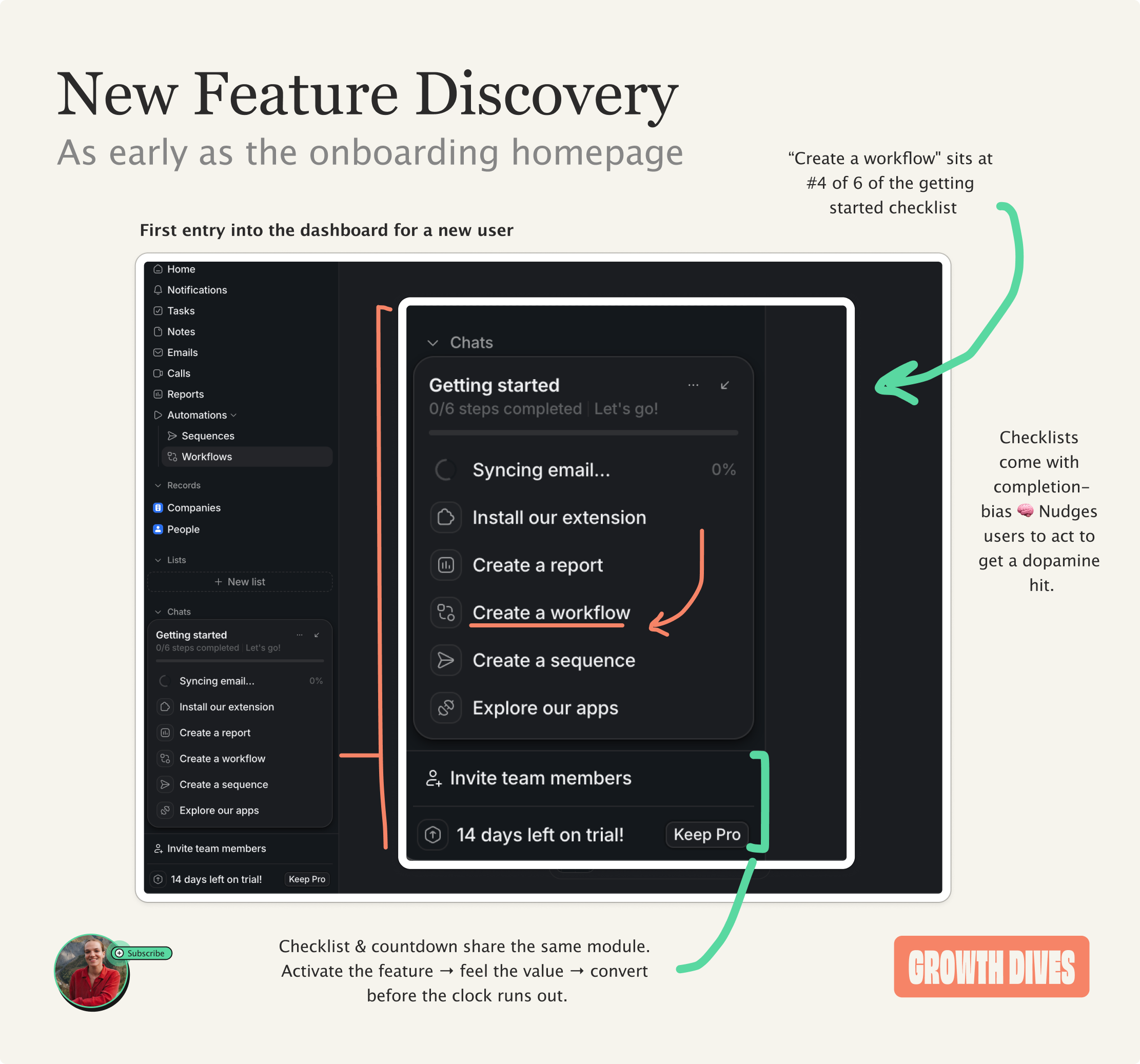
“Create a workflow” sits at #4 of 6 in the getting-started checklist, above sequences and apps in the side navigation.
Positioned above Invite team members and the trial countdown in a neat module, the list itself comes with completion-bias 🧠 i.e. the psychological urge to finish tasks once started.
This is the more prominent position for workflows, as within the normal side navigation of the dashboard, it’s nestled under ‘Automations’.
As a result, I arrive as a new user, I’m exposed to the feature, and I give it a spin.
Next up: design for the empty space
Empty space in a product has a similar effect as writers block: it’s hard to get going.
When a user is trying to do something new, they think:
What’s possible?
How do I use this?
I can’t think of a use case?
How do I get going?
What’s a good first thing to try?
That’s why the product needs to design for indecision, newbies and writers block.
When I get to the workflows page there’s a chat box with:
Describe your workflow
A beginner-level prompt - nice. But still hard for some. SO, there’s four example actions:
Book discovery
Lead triage
Deal nudge
Health check
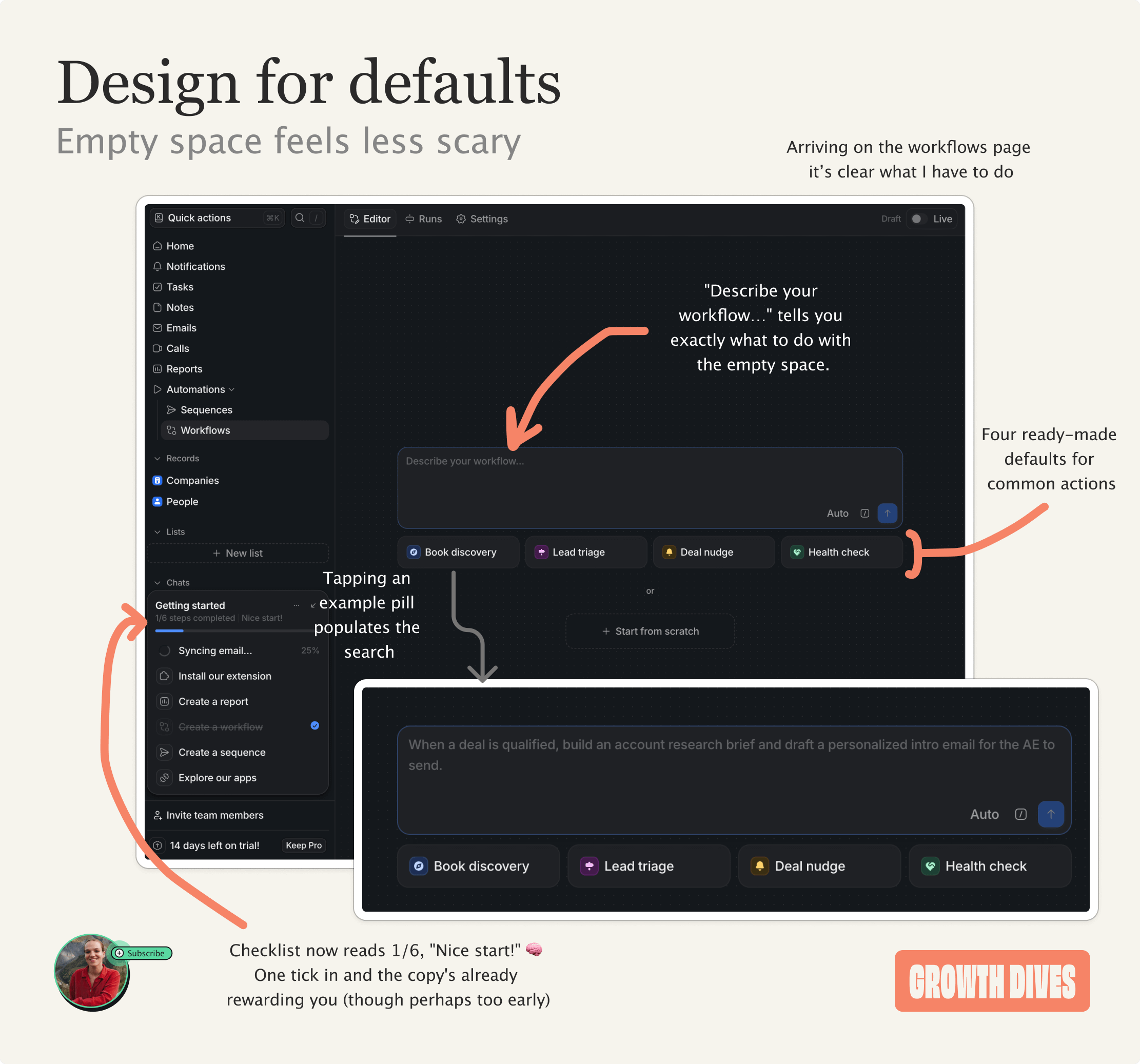
The interaction design is nice.
Once you hover on a prompt, it fills in the box. Once you click, the grey text turns white.
Hovering over all the suggested prompts I start to see what a good prompt looks like.
What’s nice about these is:
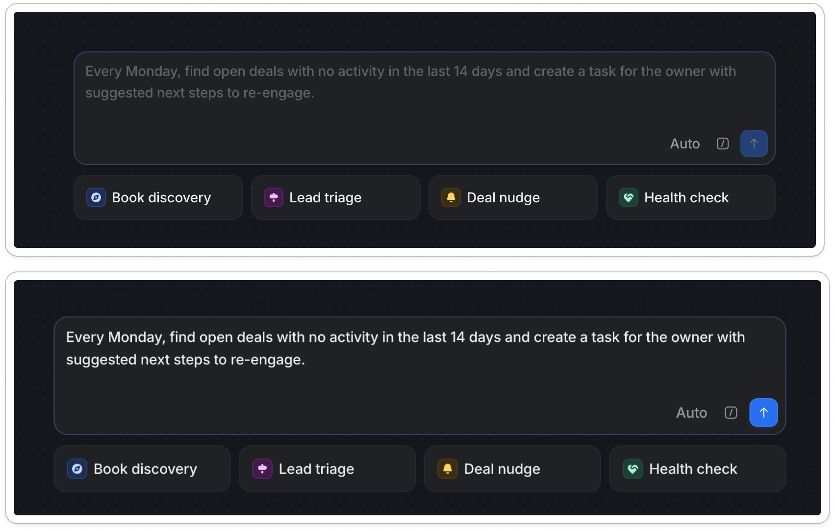
It teaches by example, not instruction: Instead of a tooltip explaining, the placeholder is a perfectly-formed prompt: trigger (every Monday), condition (no activity in 14 days), action (create a task with next steps). I learn as I go.
The prompt is written in customer language, not system language. “Find open deals with no activity… create a task for the owner to re-engage.” That’s workflows described in the reps words.
It’s low-stakes enough to try an agentic action: only two of these actions are customer facing, and they’re all painful, manual parts of the deal process. An easy and tempting first step to take.
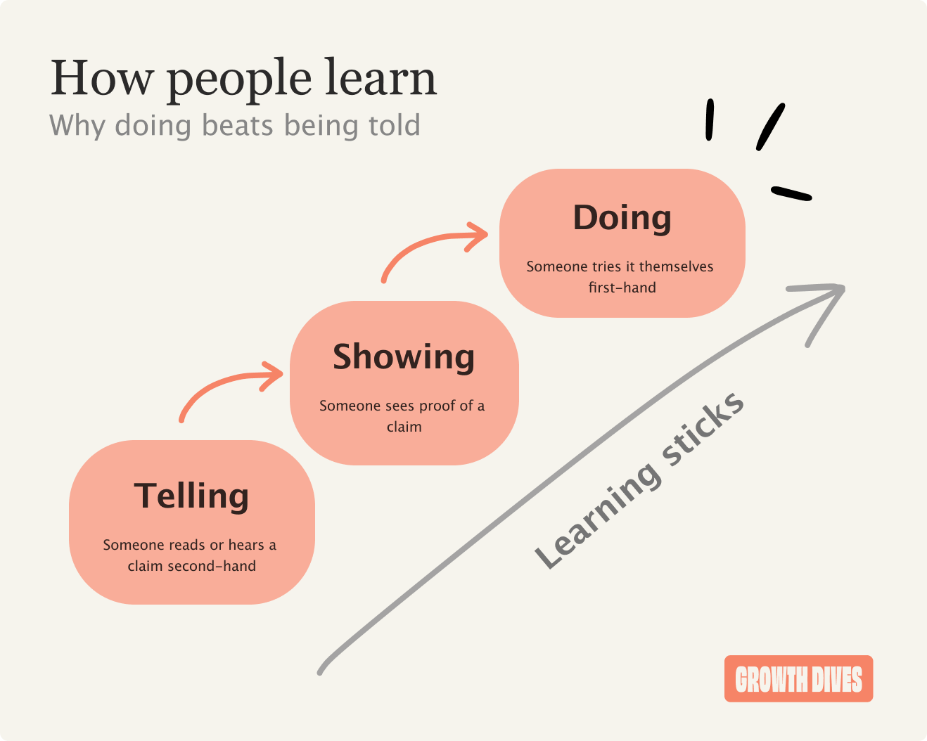
When there’s a new behaviour to learn, showing beats telling and doing beats both.
So, I pick ‘deal nudge’ and watch it get to work.
Show the working
This is the moment the agent could feel like a black box. I’ve handed something over and I’m waiting, hoping it understood me.
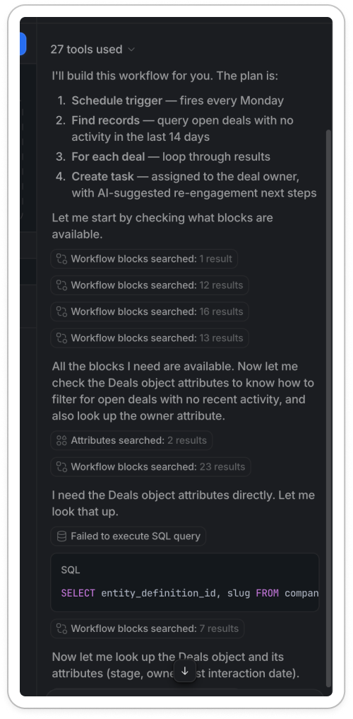
Instead, the chat shows me everything it’s doing. Under a ‘Thinking’ dropdown, each step appears as it happens:
I need the Deals object attributes. Let me look that up.
SQL query it runs
The number of results it gets back (e.g. 1 row in 115ms)
Whether it has enough information to carry on
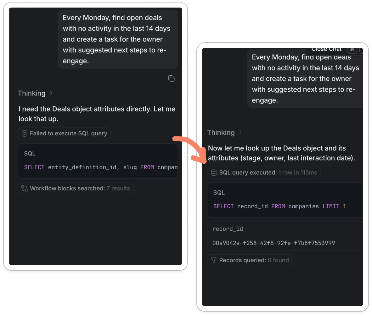
It even shows the failures. One query comes back ‘Failed to execute SQL query’. The agent adjusts, runs a cleaner one, and gets a result. Many products would hide a fail but Attio leaves it in to show that it can learn and get better, makes it feel real.
Whilst something that’s perfect and flawless is tempting, it can look staged. A lil’ stumble looks like it’s actually working it out live.
This is the labour illusion 🧠 when you can see the work being done, the system feels more trustworthy, even if the wait is the same.
Trust in AI is not about perfect, it’s about seeing the work and signing it off, or course correcting if needed. I trust it because I watched it get something wrong, then fix it.
By the time it’s finished, I can click a drop down to see all the steps. Not that I get them all, but it feels cool.
On to the final step.
Lastly, allow sign off
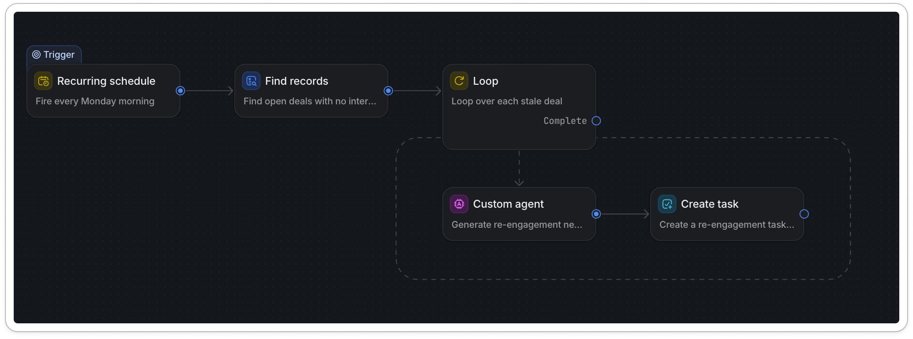
As the chat gets to work in the right hand pane (thinking, showing me the working, letting me in) on the right the page starts to… build.
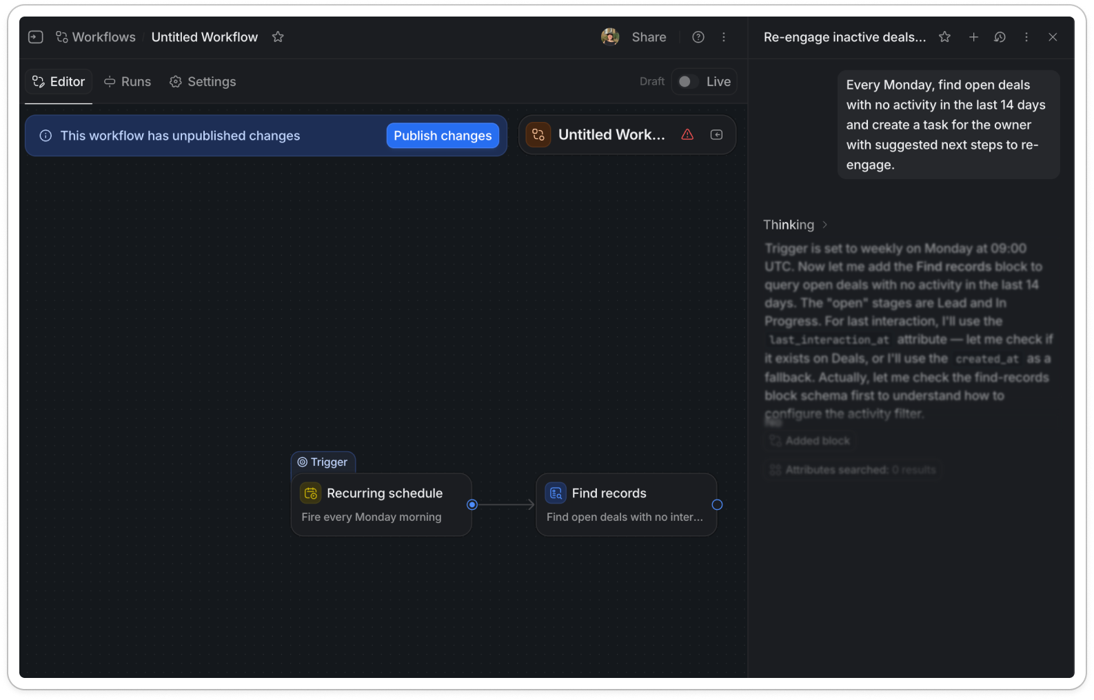
By the time the chat is finished, the agent has built the full workflow on the canvas:
A recurring schedule (fire every Monday morning)
Find records (open deals with no activity)
A dotted loop over each stale deal
A custom agent to write the re-engagement note
Create a task, assigned to the deal owner
Across the top of the editor there’s a banner: This workflow has unpublished changes, with a single Publish changes button. There’s a Draft / Live toggle in the corner.
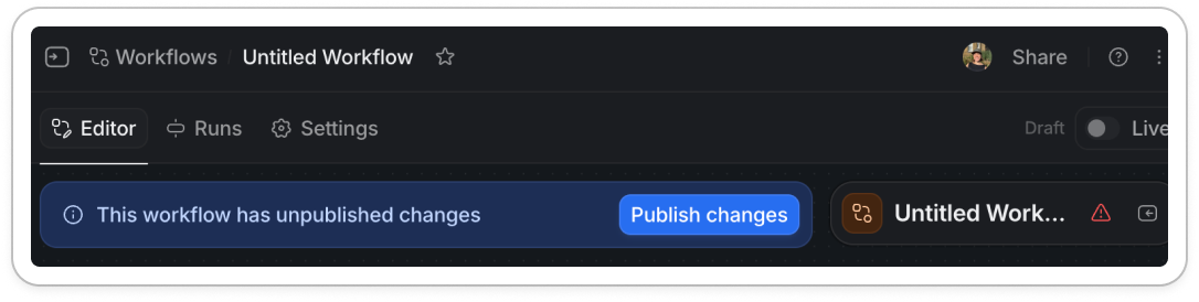
Across the dark UI this blue banner with the bright ‘Publish changes’ button is the most striking thing on the page.
It’s calling out to me ‘you have control to sign this off here’.
The key thing this UI is telling me is that I’m handing over the effort, not the control.
The layout helps too. It’s the workflow builder I already know: trigger → step → step → done, left to right on a canvas, boxes and arrows. The agentic part is new, but the format is one I’ve seen for years in CRM tools.
The UI is not necessarily needed - but with these complex workflows, UI is trusted more over natural language. The UI of the workflow is the thing that creates trust by showing me the steps.
It’s the same move Attio made last time; a CRM that looks like a CRM. They didn’t ask me to learn a new way of working, they let an agent work inside ways I’m used to.
In conclusion:
Funnily enough I was going to call this when your CRM starts to act, because the last Attio growth dive I did was called when your CRM starts to think.
But ‘act’ was the wrong word.
The CRM doesn’t act on its own. It drafts, it shows its working, waits. Then it builds the thing in front of me, stops one button short and asks: good?
And the reason I am happy to answer ‘good’ comes down to the four moves we walked through:
Discovery: the feature surfaced in the onboarding checklist got me there in the first place.
Defaults got me started. Four example pills turned a blank box into one click, so I never had to face the empty space.
Proof got me to trust it. The ‘Thinking’ dropdown showed the working (a failed query, a fix) so I watched it get something wrong and course-correct.
Sign-off gave me control. It built the whole workflow on a canvas I already understood, then handed me one bright button: Publish.
In the days where it’s easier to build than ever, anyone can build. The hard part for us in product is now around trust.
In partnership with Attio. Thanks for the early look at Workflows 🤟🏻