

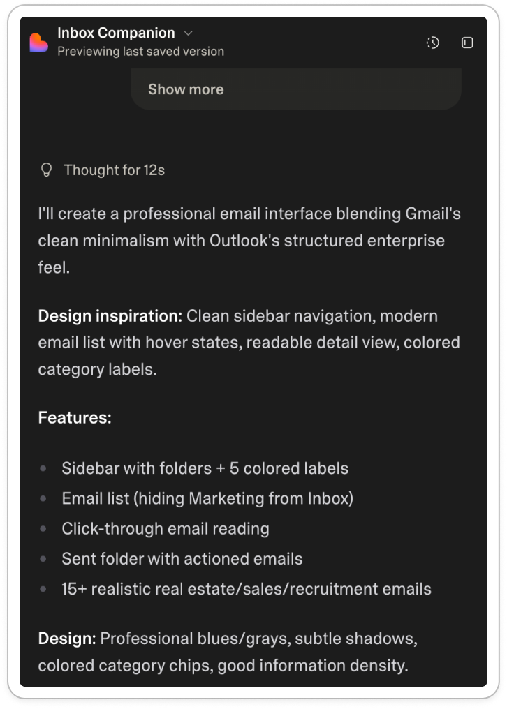
UI in the age of AI
Reflections after six months of working in product at an AI startup.

Last August, I published an article on NLX: natural language UX.
At the time, I had just started at Fyxer. Six months later, I’ve been sitting with the idea a bit longer and safe to say there’s more to say here.
In the original article, I argued that many of the product design levers we’re used to either don’t exist anymore or matter far less.
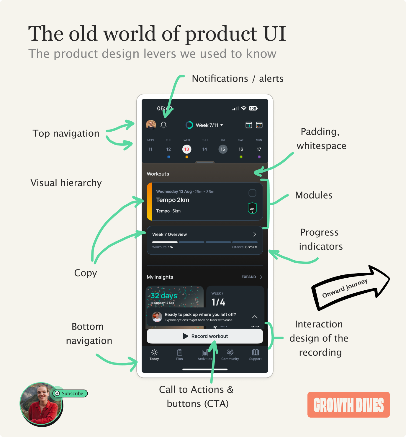
The AI’s output itself has become the main product. UI now acts as a set of nudges to get customers to use it properly, or to build trust.
At first glance this can feel like there is less to design 🎻
But in practice, the design choices get much more challenging.
Most AI products are trying to do two things at the same time:
Build trust, that the product can get your work done, and
Remove friction to getting said work done.
Do you see the issue here?
If you remove most of the human effort, the user has to trust the system a lot more to let it do the work.
But if you build trust by letting the user fiddle with every part of the UI, then the effort required from the human increases. Have you really removed the labour?
AI product design isn’t really about UI anymore. It’s about deciding how much work the user should do, and how much trust they’re willing to place in the tech.
Instead of starting with design - colors, buttons, layout - designers now have to take another step back.
And ask who your customer is, how much guidance they need, and how they should interact with AI.
It’s easier to explain when you think of two main axes:
• How much work the user does
• How much of the system’s work is visible
This then pops out…. 🥁 🥁 🥁
The four strategies for designing AI products
Most AI products today sit somewhere between four broad approaches. Each one represents a different balance between how much work the user does and how much they trust the system to do work for them.
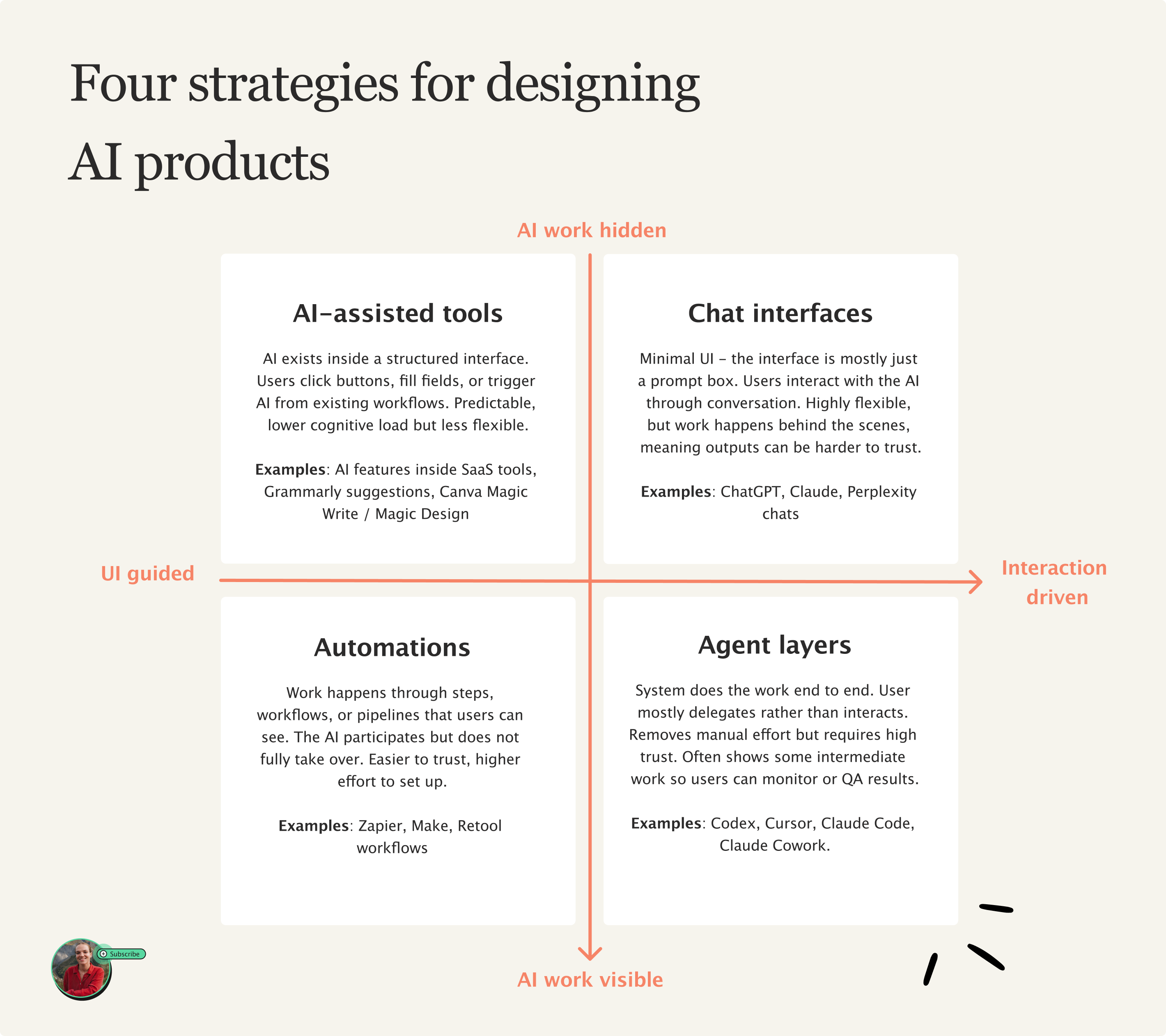
Let’s go through 1 by 1:
Top left: AI-assisted features
What these are: AI is embedded inside an interface. Customers use AI it through buttons, menus, templates, or predefined actions. The system strongly guides what you can do next - it is essentially a range of templates and presets.
✅ Pros: Predictable and ‘safe’ for the user, relatively low cognitive load.
😶🌫️ Cons: Less flexible use of AI - the system can only do what the interface allows.
🙋🏻♀️ Target audiences: non-technical users, general population.
❓ Examples: AI features inside SaaS tools, Grammarly suggestions, Canva Magic Write / Magic Design
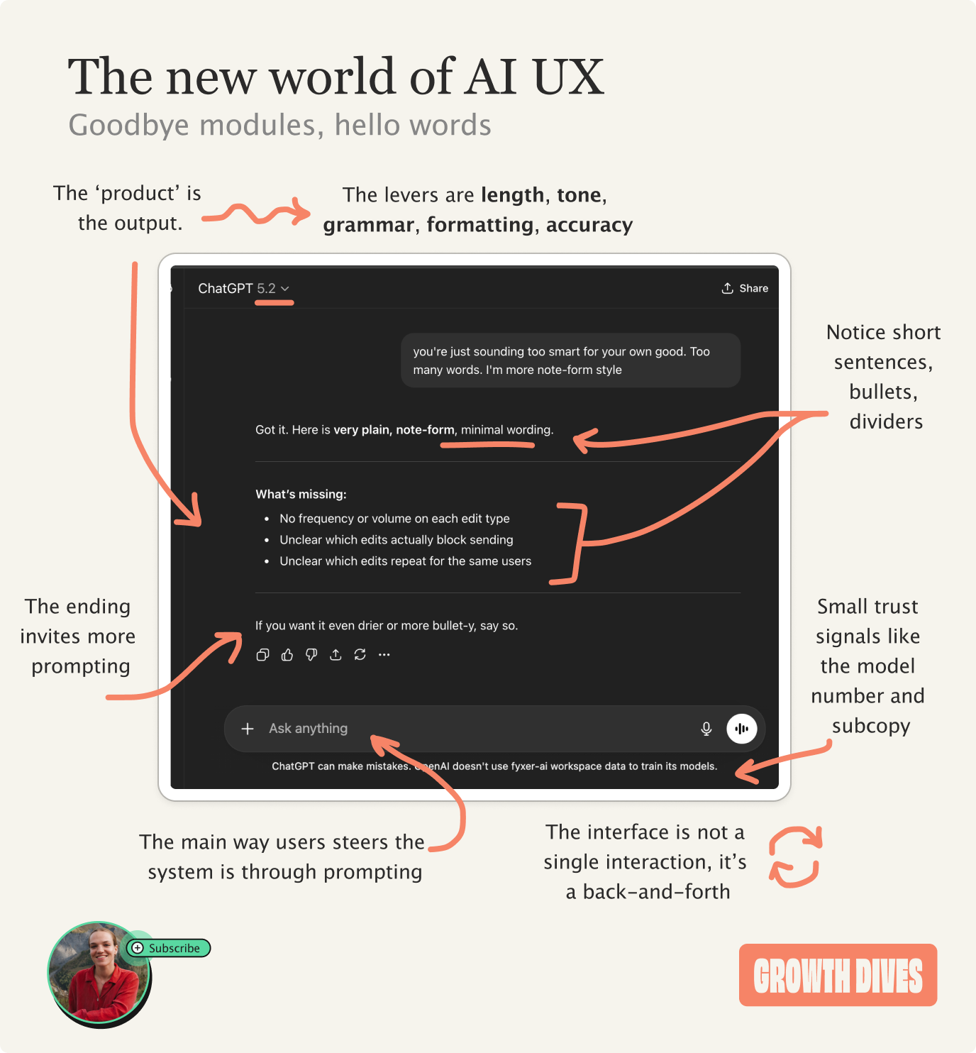
Top right: Chat interfaces
What these are: hardly any UI, often just a prompt box. Users interact with the system through language and back-and-forth conversation. Instead of clicking buttons, the user describes what they want and refines it through chatting.
✅ Pros: Extremely flexible. Users can ask for almost anything.
😶🌫️ Cons: Work happens behind the scenes, meaning outputs can be harder to trust. Without good prompting, can get inaccurate answers and lack of a paper trail.
🙋🏻♀️ Target audiences: General population. Chat is now a universal, familiar interface - nearly 1bn people now use ChatGPT.
❓ Examples: ChatGPT, Claude, Perplexity chats.
Bottom left: Automations
What these are: AI is used inside workflows that run through step-by-step. The user defines triggers and processes, the system then performs tasks automatically but within a structured process that the person can see.
✅ Pros: Transparent and trustworthy. Users can see what the system is doing step-by-step.
😶🌫️ Cons: Often requires more setup. Users have to spend time configuring workflows before the automation actually saves time.
🙋🏻♀️ Target audiences: Operators, power users, people comfortable setting up systems.
❓ Examples: Zapier AI workflows, Make, Retool workflows.

Bottom right: Agents
What these are: The system performs tasks end-to-end on behalf of the user. Instead of interacting step-by-step, the user delegates goals or outcomes and the AI handles the process. Users can often see the steps so they can check the work.
✅ Pros: Removes the most manual work. The system can plan, execute, and iterate on tasks independently.
😶🌫️ Cons: Requires extremely high trust. Users often feel uncomfortable if they cannot see or control what the system is doing. Ofc, still needs QA.
🧑🚀 Target audiences: Technical users, early adopters, people comfortable delegating large chunks of their work to AI.
❓ Examples: Cursor, Claude Code, Codex, Lindy, Lovable.
Underneath all four of these approaches are the same two design decisions: how much work the user does, and how much of the machine’s work we show them.
Both of which are product decisions you can influence.
The first decision: UI vs interaction
On one end, you can build products that rely heavily on visible things: buttons, menus, flows, carousels, images. The system is heavy-handed in what it guides you to do in the product.

At the other end of the spectrum, your AI products can be minimal, devoid of UI - just a prompt box. The user interacts with the system through language and back-and-forth conversation.
This gives maximum flexibility. But it pushes more thinking onto the user, who now has to figure out what to ask and how to ask it.
So the first design decision becomes:
How much structure should the interface provide vs how much freedom should the interaction allow?
Are you designing a guided path, or handing users a blank page?
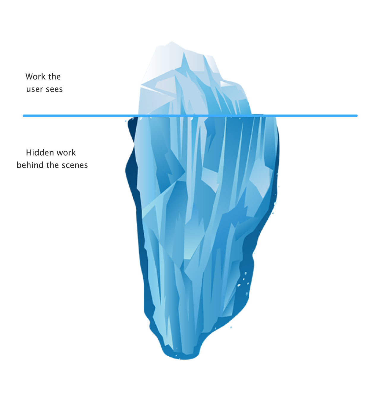
The second decision: visible work vs hidden work
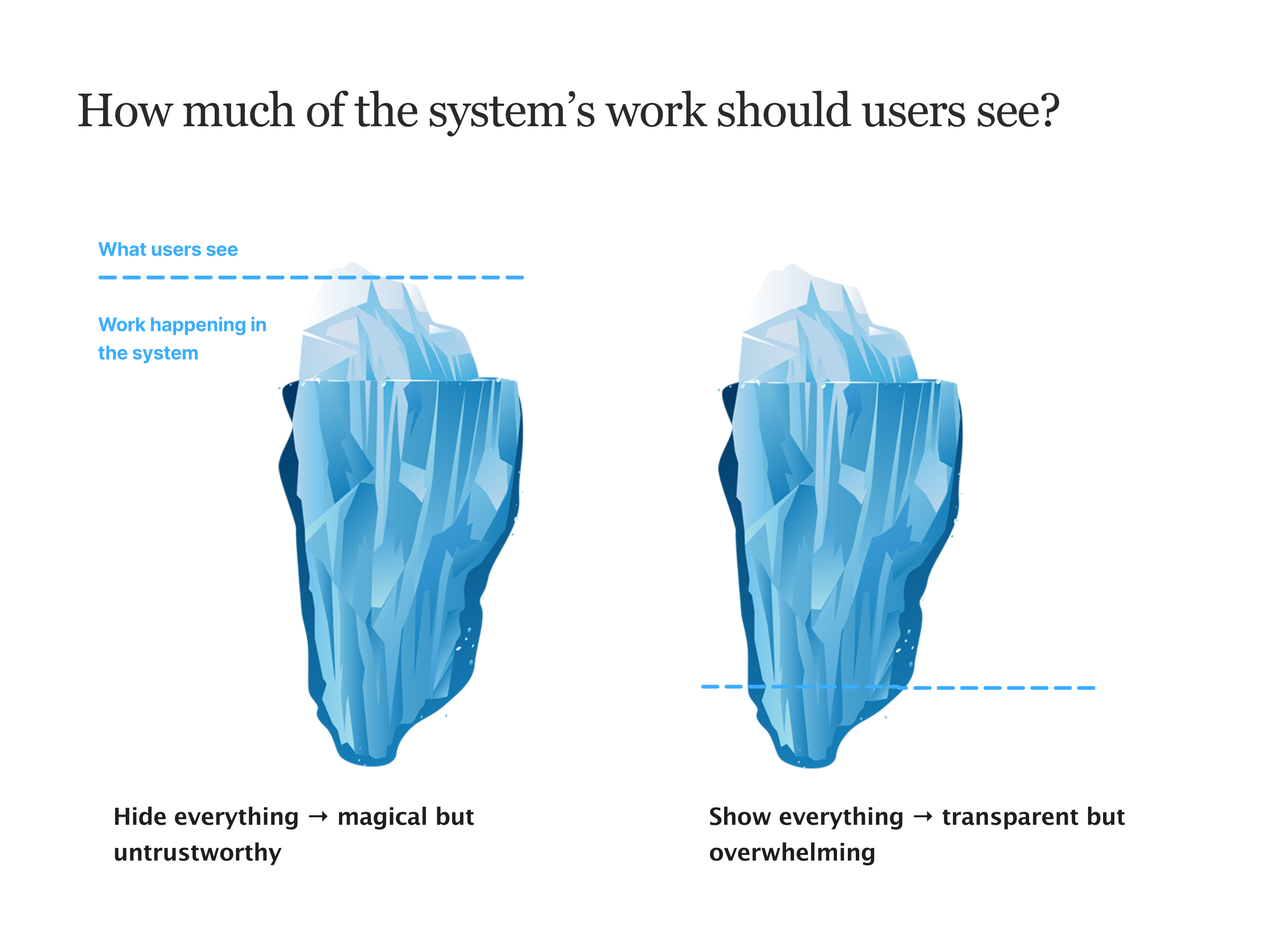
This design decision is about trust.
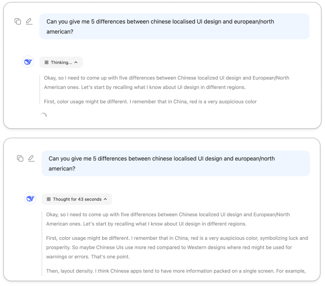
AI systems can either show their work, or hide it. If everything is hidden, the system simply produces an output. This can feel magical, but it also makes the result harder to ‘get’ or believe.
If everything is visible, users can see every step the system takes. This can build trust, but it also creates mental overload. It defeats the point if you take more time reading through every step the AI took…
So the second design decision becomes:
How much of the machine’s work should the user see?
Think of it like an iceberg:
This ‘visible’ work can come out in thinking UI, like with Lovable:
And Deepseek:
Ultimately, these steps are only for the user. The system doesn’t need to show it, but it does to build trust.
If you show too much, it’s overwhelming. Too little, and it’s untrustworthy. That’s the key design challenge: what’s too much? Or too little?
That’s what coding agents excel at: just the right amount of ‘work’ shown.

Take Claude Code, which has:
Task steps
Thinking UI
Project plans
Questions to manage up to the user
These are all things we can play with to build trust over time.
But they don’t tell us where a product should sit in the quadrant.
So, where does product go from here?
AI product design is no longer about arranging UI components, the challenge is bigger than that.
Designers need to become more strategic and ask bigger, scarier questions about how people interact with technology.
After coming to terms with the fact that ‘product’ now lives in this weird space between UI and language - where trust and labour pull against each other - I feel like the only guiding light through these decisions is coming back to the customer 🔦
(As always).
Who is your customer?
To what extent do they:
Try new tools and explore unfamiliar interfaces
Spend time curating and configuring their experience
Want something that works out of the box
Trust AI systems to act on their behalf
Learn to lean into things over time?
Different answers to these questions push your product toward different parts of the quadrant. Some customers want control, others like delegation, others want conversation as their ‘mode’.
The real job of product design in the age of AI is figuring out how much work the user should do, and how much they’re willing to trust the system to do for them.
These are my thoughts for now.
Who knows, in six months they might change again 🤷♀️
What do you think?
Thanks for this, it’s really helpful and timely. I work exclusively in healthcare, designing products for physicians and nurses. As you can imagine, trust, stability and cognitive load are constant challenges. Especially stability. My users are not comfortable with adding anything to our products that requires any kind of additional learning or additional clicks. An obvious choice would be to keep the UI everyone is comfortable with and add AI underneath to enhance existing functionality and add new functionality as these products grow. But it has to be transparent, we have to let our users know it’s being implemented.
That’s where we bump into the trust issues you mention. As I said, stability is key, perceived or otherwise. Thanks again for your great article.